Archive for category Red
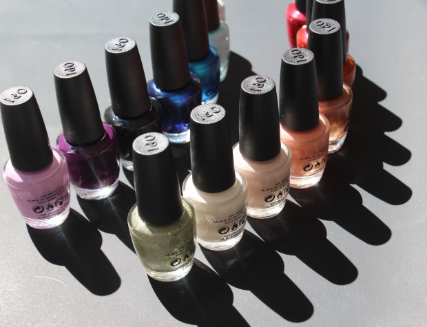
OPI Hello Kitty collection
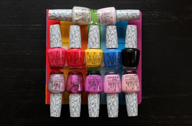
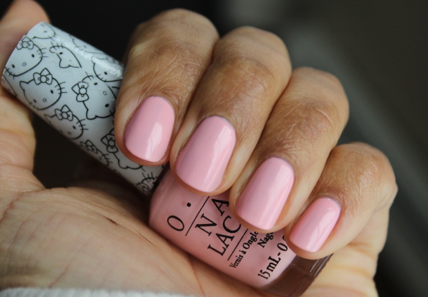
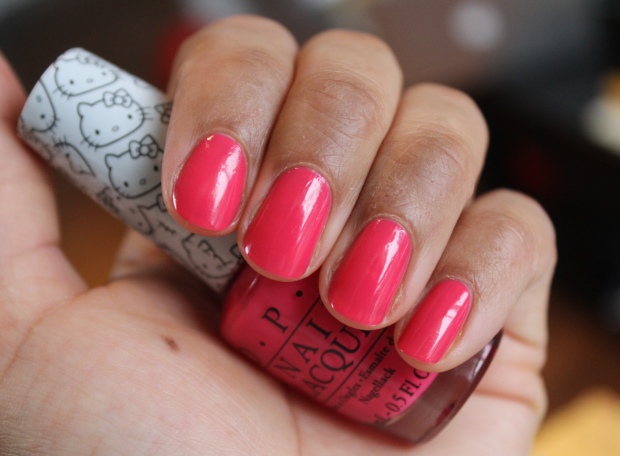
Ok. It’s 9:01pm and I try to end my screen time at 9, but I am determined to get a post up so I’m going to make this snappy! [Edit: I went to bed before this was finished…what’s a couple more hours?] I received the Hello Kitty collection from OPI last week and it’s quite good! I know absolutely NOTHING about Hello Kitty and it’s popularity (not really into cutesy stuff as a general rule) but almost all of the polishes in this collection have a great formula and the shades are on point for spring. I’m not a fan of the cheap white ‘Hello Kitty’ print labels they’ve stuck over the regular OPI bottle tops, but it’s not a deal breaker either.
I’ve gotten all fancy today and thrown in some quick comparisons for you guys as well as the swatches. Let’s dive in, shall we?
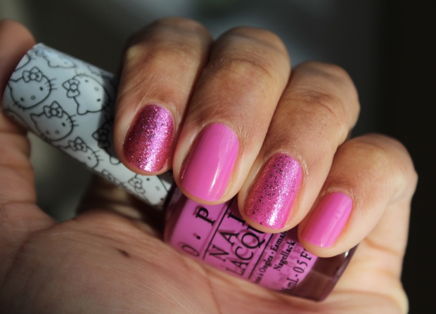
Let’s Be Friends! & Charmmy & Sugar
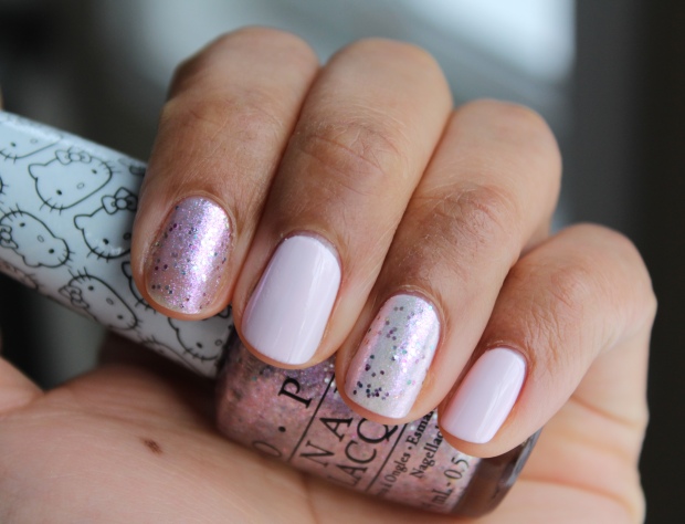
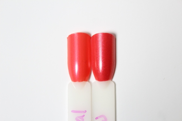
Let’s Be Friends! is a pale lilac-pink. The first coat was patchy and I worried it would be a typical pastel cream, but by the second coat it evened out beautifully – with a little care you could get away with 2 coats (I used 3 as I slept on it before taking these photos, oops). In the end this is a lovely color with a glossy finish. I wore Charmmy & Sugar (a sheer lilac shimmer with violet, blue and silver glitter and a slight greenish duo chrome) on my index finger alone (3 coats) and over Let’s Be Friends (ring finger), because let’s get real, no one wants to remove more glitter polish than necessary. It’s a great layering shade, though I prefer the ethereal look it gives on it’s own. I kind of wish this had no glitter as I love the shimmering base color but the glitter takes away from it IMO. Fairly smooth glitter and easy to apply.
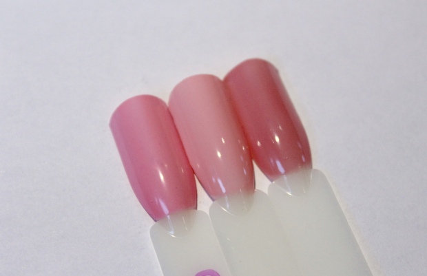
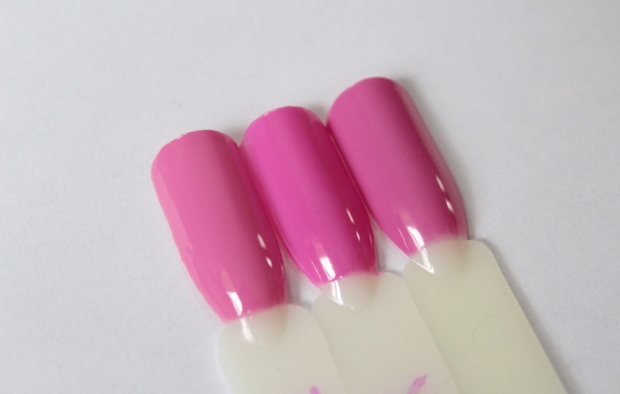
 OPI Beyond the Pale Pink, Let’s Be Friends!, OPI Patience Pays Off
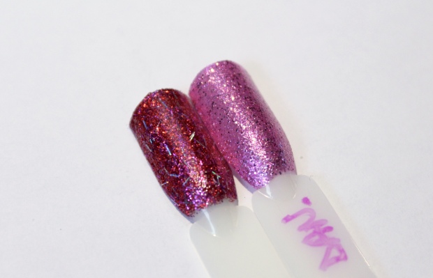
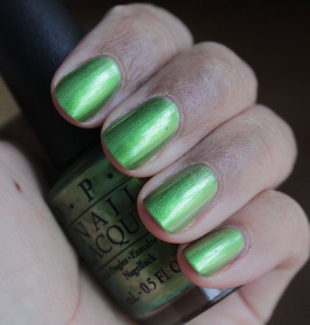
 OPI Charmmy & Sugar, Nicole for OPI DC Lover
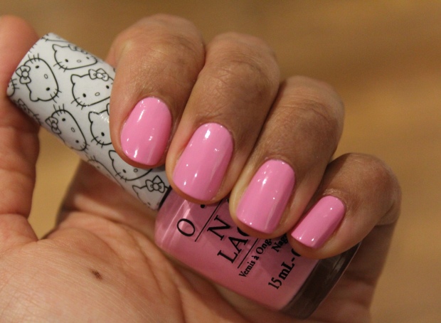
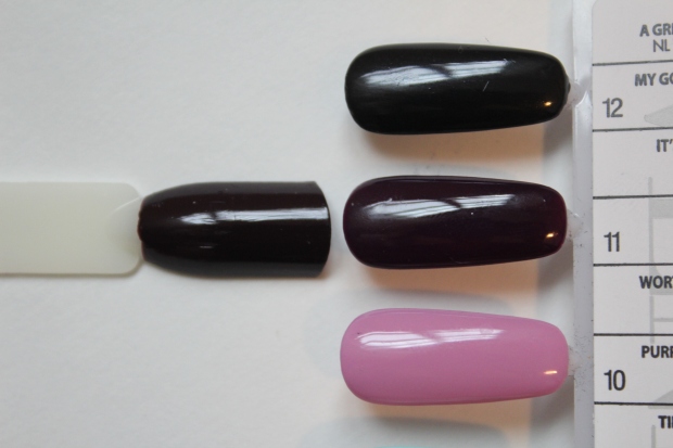
Small + Cute = ❤
A light pink cream. I love this color, but the formula is a PITA – the first coat was very streaky, the second a bit better, but it really requires 3 coats (or a very steady hand) if you want it to look flawless. A shame as this was one of my fave shades of the bunch! The formula is also a bit on the thicker side to give yourself time for it to dry (aka not before bed). Due to all the coats required and the thick formula I found this chipped within days.
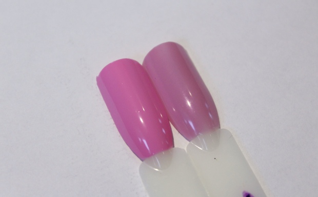
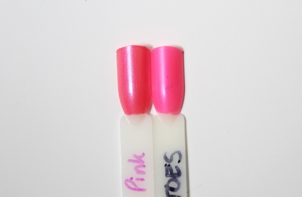
 OPI Suzi Shops & Island Hops, Small + Cute = <3, RBL Oh Slap!
Look at My Bow!
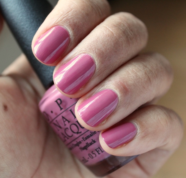
A soft orchid pink cream. This only needed 2 coats to opacity but its not 100% perfect – it’s a touch streaky. Beautiful color but not really for me, I think it’s a bit too saturated or something. I prefer the more muted look of Chanel Sweet Lilac (below).
 OPI Look at My Bow!, Chanel Sweet Lilac
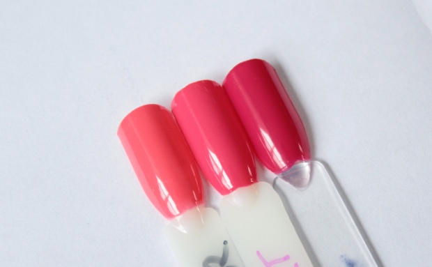
Again I paired up to avoid glitter removal. Super Cute in Pink is a medium-deep orchid crelly (creme/jelly formula). Gorgeous! You can see very slight VNL with two coats but I like it this way to preserve it’s squishy-ness. This is a perfect spring shade and was effortless to apply. Starry-Eyed for Dear Daniel is a semi-sheer orchid shimmer with violet, pink, blue and silver micro glitter. It required 3 coats to opacity on the index finger (worn alone) and 2 layered (ring finger). It’s grittier to the touch than ‘Charmmy’ but not terribly so. While I liked ‘Charmmy’ on it’s own, I prefered ‘Starry-Eyed’ layered, as it gives it more depth and punch in color.
 Essie Splash of Grenadine, OPI Super Cute in Pink, Mark Cupcake
 Zoya Kissy, OPI Starry-Eyed for Dear Daniel
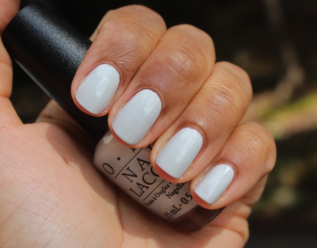
Kitty White
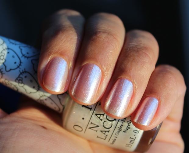
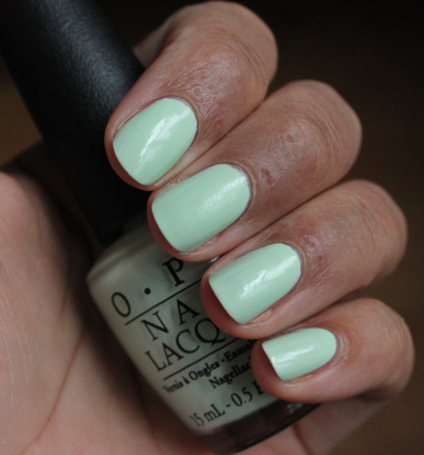
A sheer white shimmer. Sorry for the change in lighting, I found this needed sunlight to show off it’s pearlescent quality. These kind of shades aren’t really my bag, though it is pretty. Not much to say about this one, depending on your nail length you could get away with 2 coats (or if you don’t mind VNL) as I’ve done here. I’d think 3 would still not have it entirely opaque though.
 OPI Chiffon My Mind, OPI Go to Grayt Lengths, OPI Kitty White, OPI Make Light of the Situation
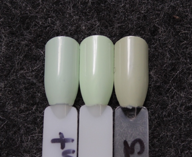
Though ‘Grayt Lengths‘ looks a lot more gray than ‘Kitty White’, when held up to the light they’re VERY similar:
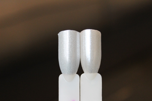 OPI Go to Grayt Lengths, OPI Kitty White
Never Have Too Mani Friends
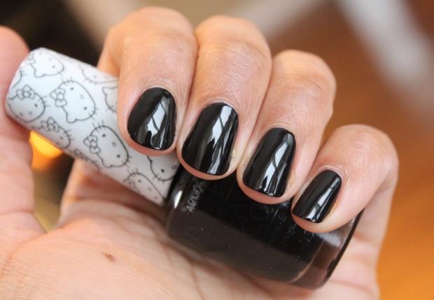
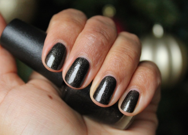
I’m not much of a black nail polish wearer except for layering purposes, but this is a great black nonetheless – another crelly finish, super shiny, super easy to apply (all of the crelly-type shades in this collection are a dream to apply). This is just 2 coats. It would be a great choice for anyone in the market for a black polish (or anyone who loves a good black polish).
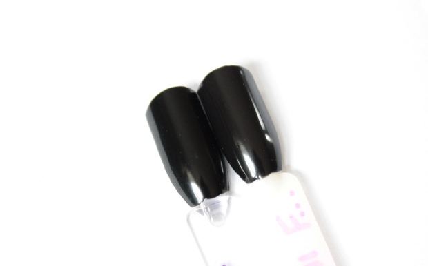 a-England Camelot, OPI Never Have Too Mani Friends
My Pal Joey
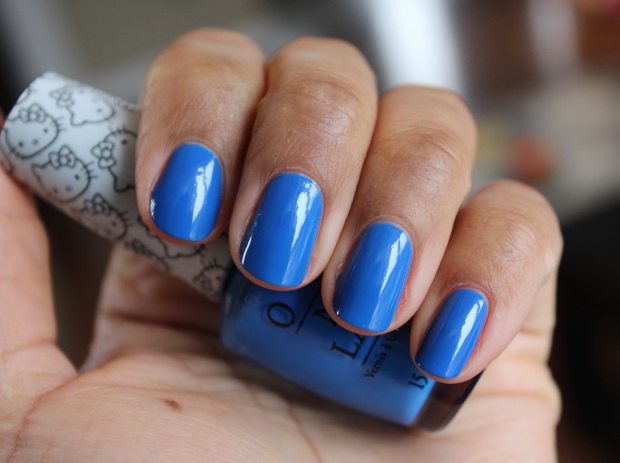
A saturated cobalt blue. It’s not as in-your-face as some other cobalt shades (think YSL Bleu Majorelle, Nails Inc Baker St.) – it’s a bit lighter and because of the crelly texture it’s not so bold in finish. I really like this – it’s playful and eye-catching, and these textures are seriously out of this world. 2 coats for opacity (no VNL in sight here). LOVE!
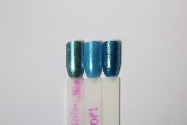
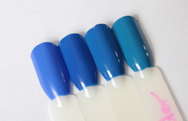 Sally Hansen Pacific Blue, YSL Bleu Majorelle, OPI My Pal Joey, OPI Wild Blue Yonder
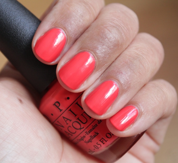
5 Apples Tall
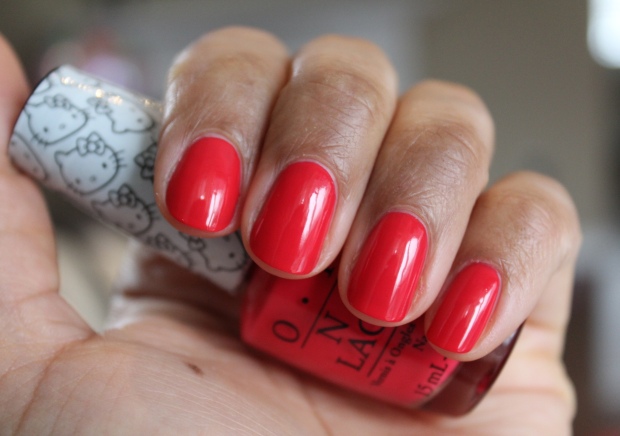
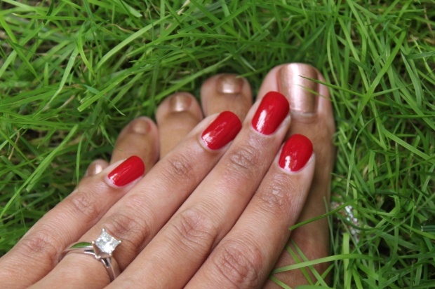
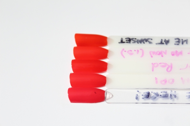
Some of these shade names I don’t get at all…ANYWAY, this is a gorgeous coral red that has a crelly finish but is fairly pigmented – if you were in a serious rush you could damn near get away with 1 coat (though I prefer the density of 2, as usual). Love the look of this! I don’t always like reds on me but this looks really flattering on my skintone (I think). So easy to apply with zero issues. It’s extremely close in color to Essie ‘Come Here!’ and I like the formula better, so I’ll be swapping this in for that!
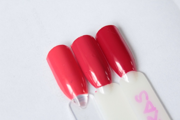 Essie Come Here!, OPI 5 Apples Tall, OPI Love is In My Cards
Spoken from the Heart
A lovely saturated warm pink. I love this one as well! Again, it has that crelly texture though it’s not as pigmented as ‘5 Apples’ so I’d suggest 2 coats for sure. Even then it gives a hint of VNL but as mentioned I don’t mind that with formulas like this, the slight translucency is what gives it that squishy finish. Again, super shiny on it’s own and a cinch to apply.
 Lippmann Daytripper, OPI Spoken from the Heart, butter London Snog
My Twim Mimmy
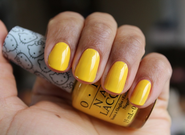
Again, WTF with the names? Anyway, this is a saturated medium yellow, very primary color-stuff (this along with the blue and red are like the most true representations of primary colors I’ve ever seen in a polish collection together). This doesn’t have the crelly texture (which would probably be a feat with yellow anyway since they’re the most annoying polish shades to work with) and is a touch streaky (I think 3 coats probably would be best so it looks flawless, but I was lazy and did 2), but as far as yellows go it’s actually not half bad. I don’t love it on my skintone especially as it’s so dense in color, but it might look better when I’m tanned.
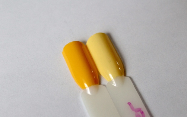 OPI My Twin Mimmy, Bee Mine Forever
Overall, I thought this collection was really well-done and even not knowing a lick about Hello Kitty, I could enjoy all the shades. These are all without base coat as well and the majority are SO SHINY! Pretty, pretty, pretty.
What are your thoughts about this collection / about Hello Kitty? What is the DEAL?
OPI Starlight collection for Holiday 2015, Part III: The reds and the rest
Posted by Latoya in Glitter, Holiday, Holiday 2015, Holographic, Metallic, Nail Polish, OPI, Red, Shimmer, Silver on December 30, 2015
OK! So let’s wrap up this up finally, shall we? Way to drag out a review, huh? At least I’m getting it done before the years’ end 🙂 It only took me almost a month! (which, sadly, I feel kind of proud of lol…goes to show you just how free time I have!) I apologize for not getting the festive reds to you before Christmas – but red is the kind of color you can wear any time of year, really, so I guess it’s not that bad.
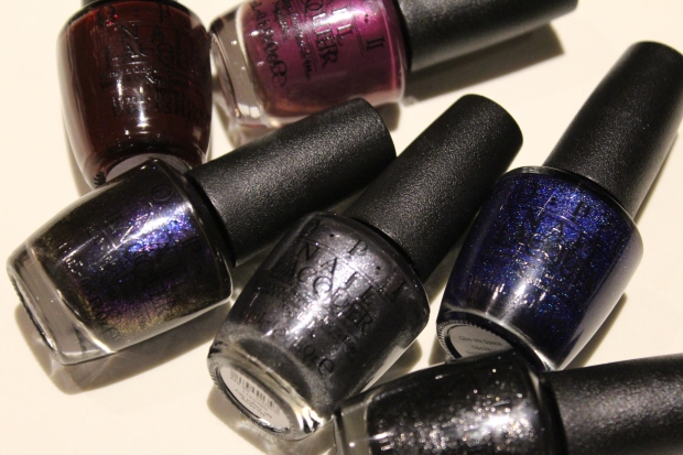
Alternately, the other 3 polishes I’m going to show you are…well here, first let me show you what they look like in the bottles:
The look fairly innocuous, no? Sparkling, shimmering, glittering polishes for the holidays – perfect, right? But IRL, they’re just…no. Trust. You are NOT missing out on anything with those three, which is why I saved them for last. Here, lemme show you them first so you can feel reassured:
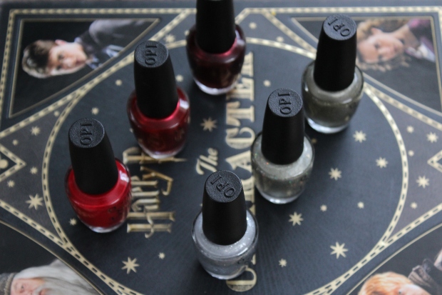
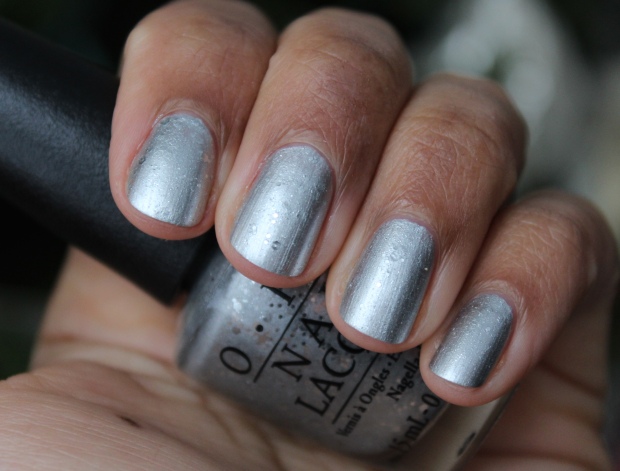
Is This Star Taken?
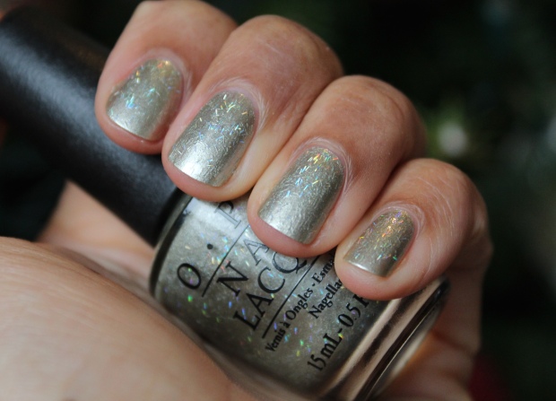
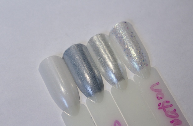
Of the three, this one is the least offensive – prismatic bar glitter in a silvery-pewter base. This one *could* be so cool but it still falls flat somehow. Maybe the base color needs to be more sheer? I took the swatch on an angle to show you the prismatic effect but for the most part it’s lost when looking at the nail directly. ~sad face~ It’s easy enough to apply though, 2 coats and you’re done.
Comet Closer
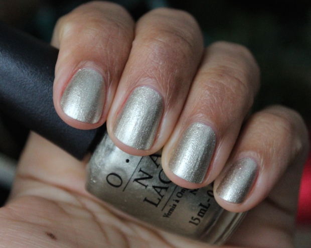
This has a similar pewter-silver base but heavier on the silver, and I don’t like it as much on my skintone. Besides that, it contains gold micro glitter that leaves it just looking rough and bumpy, and again the effect is lost anyway in the opaque base. Overall BLAH.
By the Light of the Moon
This is the worst offender! Silver glitter chunks of varying size floating around in an opaque base – I think OPI is trying to make this a ‘thing’ but honestly, it’s just horrid. Remember Pineapples Have Peelings Too? BLECH. I just can’t with these, they make me angry just looking at them!
Ok, so those3 are a no-go…but the next 3 are quite nice, so this post isn’t a total waste! Let’s check them out:
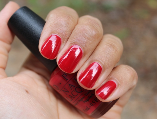
Love is in My Cards
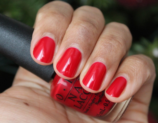
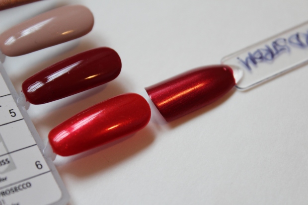
Though I don’t wear red polish much (despite having like, 10 red polishes…WTF), I really like this one! It’s bold, bright and leans ever so slightly cool, and I find it very flattering on my skintone. I’m tempted to hang on to this and maybe ditch a couple other bright reds I have. Great formula too, super easy to apply and I think this swatch is only 1 coat!
Ro-Man-ce on the Moon
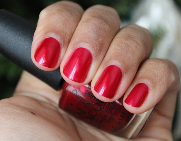
A cool-ish red metallic, standard holiday fare. In my photos this looks almost identical to ‘Love is in My Cards‘ but the metallic effect is more pronounced in person. I like this one too, but I prefer my Misa Red Pumps at the Nordstrom more – I think the depth of color is a bit stronger in that one (also the name of the Misa polish is awesome). Again, this is only 1 coat!
Let Your Love Shine
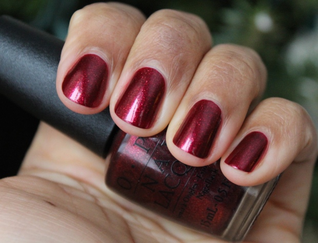
You don’t need me to tell you that this polish is GORGEOUS! This is the kind of red I gravitate toward (and most of the reds I own are similar to this – more of a deep shimmering red). This is kind of a cross between Lippmann’s Through the Fire (for the color) and Zoya India (for the larger shimmer particles). It did require 2 coats but that ain’t no thang. I love this one – definitely a keeper.
That’s it, we’re done! Hoo-frickin’-ray. Overall I am really digging the collection (see Part I and Part II here if you haven’t seen them already!) save for a couple of weird shades – it’s probably tough to come up with original polish mixes so I’ll forgive OPI for trying something new and failing miserably. I like that there weren’t TOO many reds and that they had a handful of non-traditional holiday shades, so that the collection is still wearable for the whole winter season.
And of course – some outtakes for your viewing pleasure – hope everyone had a great holiday and has a fantastic New Year!!
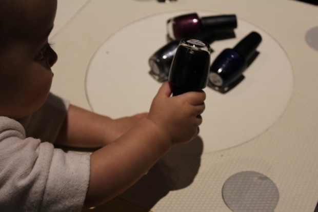
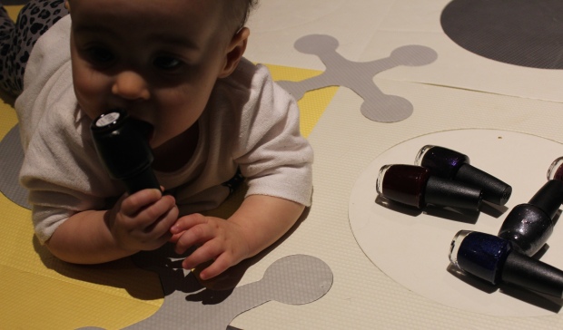
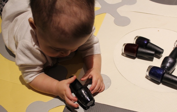
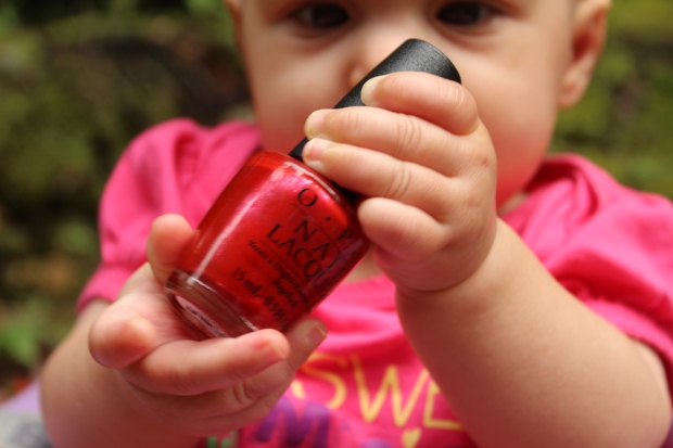
 I tell ya…you gotta move fast with this one! She’s getting more and more mobile every day 🙂
OPI Starlight collection for Holiday 2015, Part I: The Moody Hues
Ugh, you GUYZ. I’ve had these swatches done for a few days but Elena is keeping me on my toes, as usual! She’s been waking up at 4am for the past few weeks and is ready to PAR-TAY, she thinks it’s time to get up for the day and I’m DANG tired. Today she also thought resisting nap time was a great idea, so I’m just plain worn out. BUT I did finally get her down (I keep checking the monitor with fingers crossed that she’ll stay asleep for awhile) so what better time than to get these pics & post up?
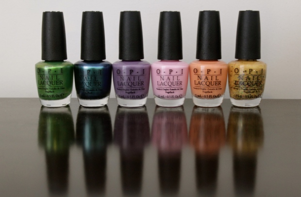
I am extremely surprised at how much I’m enjoying the Starlight holiday collection from OPI – metallics and glitters are generally NOT my jam, but these are really doing it for me so far! The sparkle on a lot of these really is ‘out of this world’ (cue the cheese) and they look so pretty and festive in the dim light cast by the fire and/or Christmas tree. I keep wanting to change my mani every day to try them all fully (but ain’t nobody in THIS house got time for that, sadly). I’m working my way through the swatches though so I will have them all up before Christmas, I promise! Today I’m bringing you the first 6 which are the more moody, mysterious hues of the 18 shades in the collection (which, if I’m being honest, is INSANE – 18 colors!? When did polish collections get so HUGE?).
All swatches were taken in natural light unless otherwise specified.
Guys & Galaxies – a deep dark brown-red. It looks a touch streaky in the swatch above, but IRL it’s not, though you do need 3 coats to reach full opacity. It’s very glossy on it’s own – the shot above is with no top coat. It’s an easy formula to work with overall, despite needing that extra coat (though it’s a *touch* staining). I think this is a very sexy shade – and it’s NOT near black, which makes me happy.
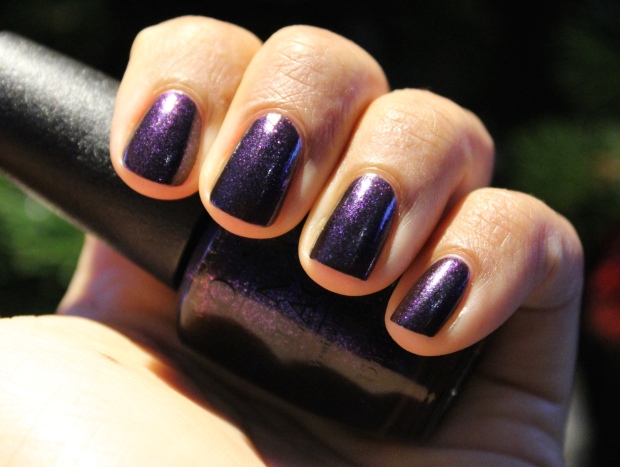
I’m in the Moon for Love – this is a medium plum shimmer with golden micro-shimmer. Every time OPI comes out with a shade like this (Dutch’ya Love OPI?, Lost My Bikini in Molokini, Purpletual Emotion…), I’m like ‘eh’ – even though they all look flattering on my skintone, I just can’t get into these types of purples. There is a depth and richness to this shade that appeals to me (you can see it better in the 2nd photo, taken under artificial light), but I know it’ll just be another purple that I keep NOT wearing regardless. Good formula though, two coats to opacity, with no application issues at all.
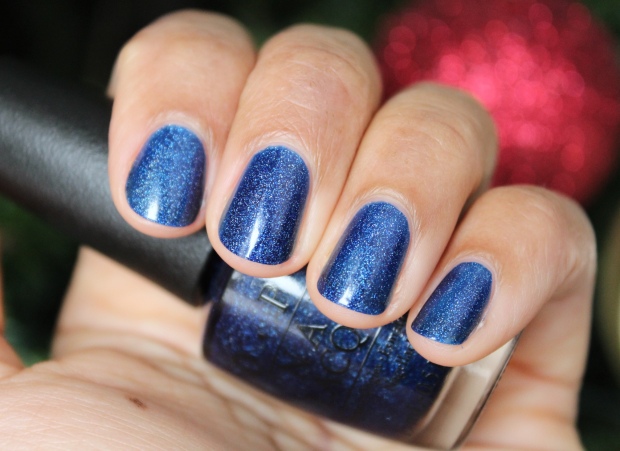
Cosmo With a Twist – a royal blue with lighter blue shimmer that looks purple in some light due to a duo chrome finish. This SHADE, you guys!!! So, so gorgeous – it really looks like Outer Space to me. It needs 3-4 coats to reach full opacity, but it’s totally worth it. I would have never picked up this shade if left to my own devices, but I’m SO happy I got to try it out. Perfect holiday shade that’s not your typical red/silver/gold.
Give Me Space – a bold, medium blue with silver shimmer. This has a VERY slight prismatic effect that’s really only visible in sunlight – so don’t let that be a reason you pick it up! The first coat went on sheer but it managed full opacity in two coats. I found this shade a touch fussy to apply, it can pull in spots if not applied with a relatively quick hand. I suggest loading up the brush and applying coats in one go, versus dipping back into the bottle. This is a beautifully rich shade, but along with the shimmer being a let down it didn’t wow me.
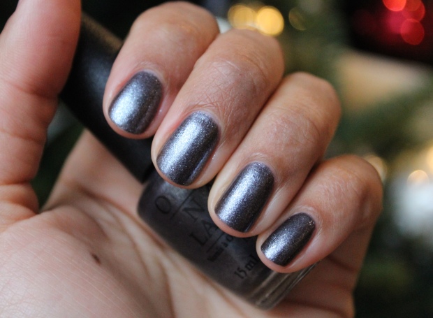
No More Mr. Night Sky – a sparkling gunmetal. This is quite sheer; it requires at least 3 coats and looks best with 4. Despite that: he-LLO, gorgeous! This is another polish I would have never picked up as I don’t gravitate toward shimmers, but holy smokes – this is so pretty!! It’s the most beautifully sparkly, twinkly polish I think I’ve ever seen. It looks particularly amazing in low lighting (the 2nd photo), so it’s PERFECT for the holiday seasons parties and hanging out by the Christmas tree.
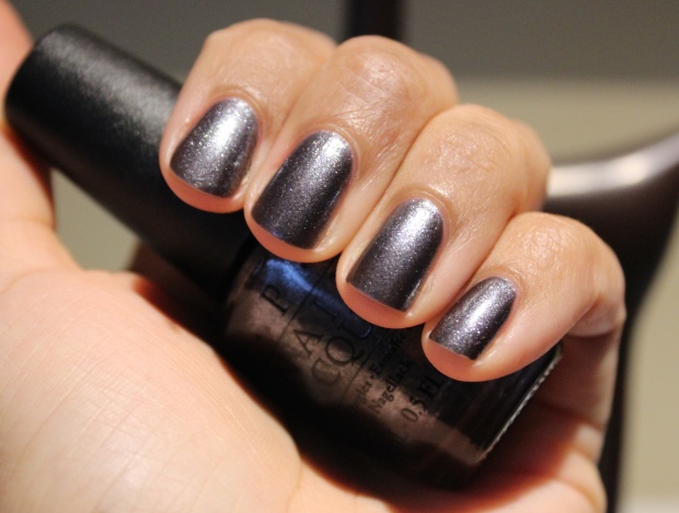
Centre of the You-niverse – a charcoal with silver shimmer and black glitter bits. This is 2 coats, though depending on how thickly you apply your coats you may need a 3rd. Even though it’s got minimal glitter, they’re so tiny they’re a pain to remove entirely. For black polish lovers though this is a great shade; top coat makes it really gleam.
Sooo, basically I want to keep 4 of the 6 shades shown…that does NOT help me decrease my polish collection! Dang it. I just think these are so lovely for the holiday season or for any time you want a bit of sparkle that’s a little understated (re: not a full-on glitter) but still fabulous. Well done so far, OPI!
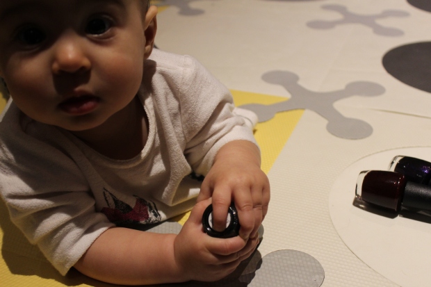
Photo outtakes: Last night when I took the bottle shots Elena hightailed it to where I was and got her grabby hands in there lol…at least I got one good shot (above) before the destruction!
 Who, me?
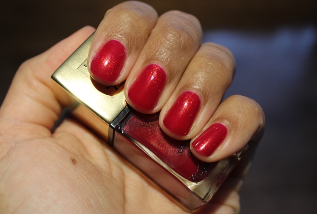
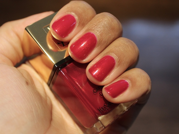
YSL La Laque Carmin D’Or: Christmas in a bottle
Posted by Latoya in Holiday, Holiday 2015, Nail Polish, Red, YSL on December 1, 2015
You know you’re a beauty junkie when you buy things and forget about them. During the Sephora sale, I kept thinking I should buy something festive from one of the holiday collections, since I didn’t pick anything up from any of them….OH WAIT, YES I DID – the YSL Carmin D’Or polish from the ‘Kiss & Love‘ holiday collection, a gor-ge-ous scarlet with fiery golden shimmer throughout. Oops. I forgot. (I also bought Dior’s insanely beautiful Gris-Or from the ‘State of Gold’ holiday collection, which I ALSO forgot about….eeks. Review to come!) Right. But! Now it’s December, and it’s time to wear all my pretty festive nail polishes! So, we’re starting with this beauty:
 Natural light
 Artificial light
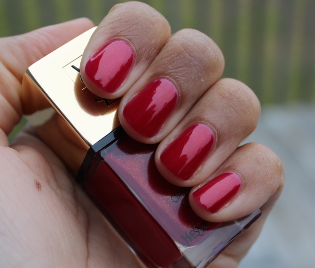
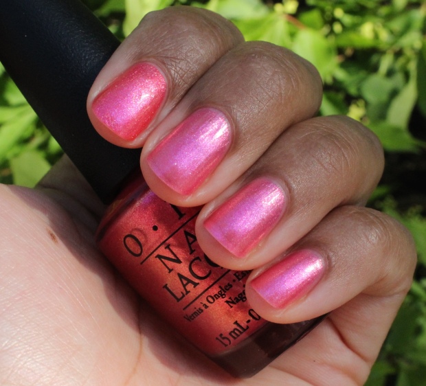
It’s actually got a significant blue lean that I had a hard time capturing on camera – meaning it’s not a true red at all but more of a pink-red. I didn’t realize that when I swatched it in store, but I kind of like that because it makes it different than your standard golden red polish. The shimmer is incredible, it absolutely GLOWS no matter what light you’re in (although my outdoor pic doesn’t show that). The formula is also wonderful, with a thin-to-medium viscosity to allow easy application – two coats to full opacity, no fuss. This is my second YSL polish and so far I’m very impressed. It hurts to pay $27CAD (although it pleases me that it’s the same price in the US) but the upside to buying less polish overall is that when you do, you don’t feel so bad spending the big $$ on a shade you love. And that squared off bottle? SEX-AY.
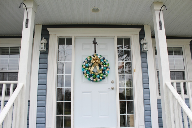
I just received the OPI Starlight Collection yesterday so I have a bunch of holiday polish shades coming your way. I may do a countdown with a different shade each day…I’ll try my best! I’m in a major holiday spirit, we put up our lights on the house last night and it looks fab! I’m working on the inside now – we went to Homes for the Holidays here in Halifax on the weekend and looking at all the decorations makes me feel so festive! And also brings out my inner Martha. Check out this wreath I made!:
Yahooooooo!! Let the holiday season truly begin! 🙂
OPI Venice collection for Fall 2015 {swatches & review}
Ok, here’s the post I’ve been promising for weeks, finally! For those who have been waiting, I’m genuinely sorry – what with the move, and the upheaval in Elena’s schedule (due to the move), carving out any time for the blog has been nearly impossible, as she naps for maybe 30 minutes at a time, tops. Nap time = mama’s productive time, therefore: no nap time = nothing accomplished. On top of that, Elena was sick with some kind of virus since Thursday and pretty much slept or snuggled on her mama for 4 days straight. I didn’t really mind – love the chance for extra cuddles! – but it was anxiety-inducing as the first time she’s been sick, and again I got a whole lot of nuthin’ done.
Anywho. She’s currently napping for who knows how long and I just can’t wait any more! May I present to you the OPI Venice collection for fall 2015!
Since time is a tickin’ I’m going to get right to it! Let’s start off with my favorite shade from the collection:
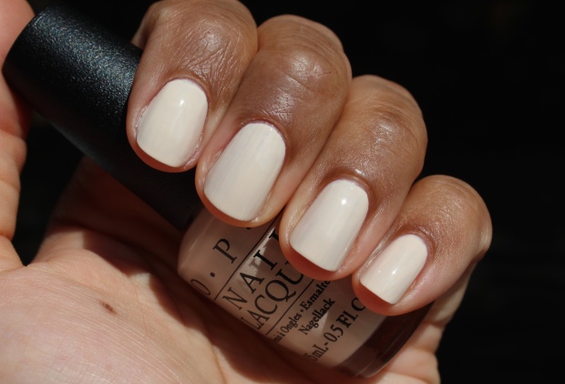
Tiramisu for Two
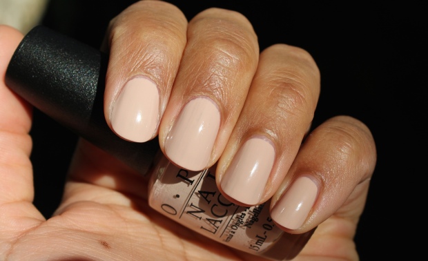
Yep, it’s a ‘plain’ ‘ol nude (described as a ‘sweet coffee cream’) – but let me assure you, this nude is anything but boring! It is SO creamy and pigmented and the perfect mix of neutral tones that makes it stupidly flattering, at least on my skintone. And the application is great too, just 2 easy coats with no drag or streaks to be found. Probably the current fave nude in my collection!
It looks a lot more pink here in this swatch but it’s just the lighting – it’s more beige in person. However, this photo does serve to show how it compares to another neutral, Dior Incognito. I’ve always found that Incognito is actually almost too pink and deep to be a true nude on me, whereas Tiramisu for Two is several tones lighter and therefore better. That’s right, I said it – an OPI is better than a Dior.
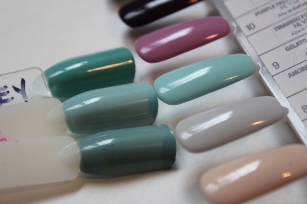
O Suzi Mio
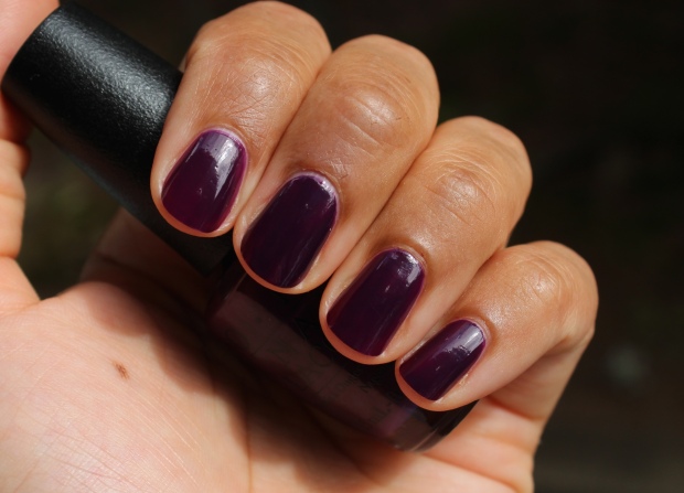
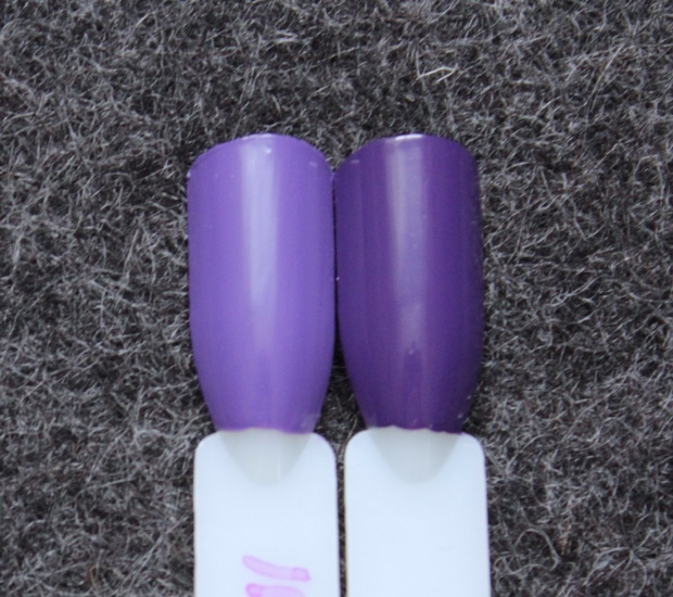
My second favourite in the collection. I absolutely ADORE the plummy tones of this polish and it’s high-shine crelly texture. So perfect for fall! Here I’m wearing it with 2 coats because I like the slight sheerness which helps retain the eggplant tone, but three will make it completely opaque.
Another reason I love this shade is that it doesn’t have that ‘almost black’ feeling about it which I really don’t favour. Here I’ve compared it to Zoya Anja which I always want to love but don’t quite because it’s just too dark. O Suzi Mio as you can see still looks purple, not black (especially when compared to the actual black shade above it).
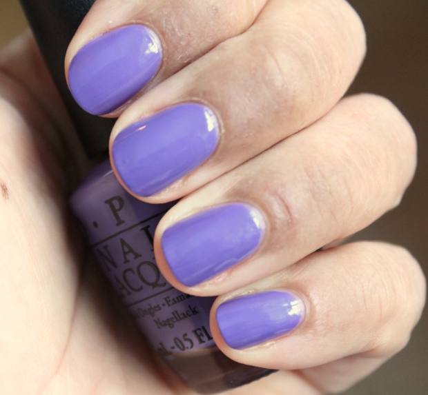
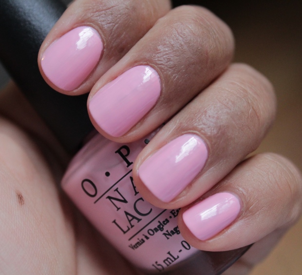
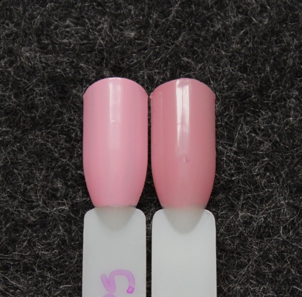
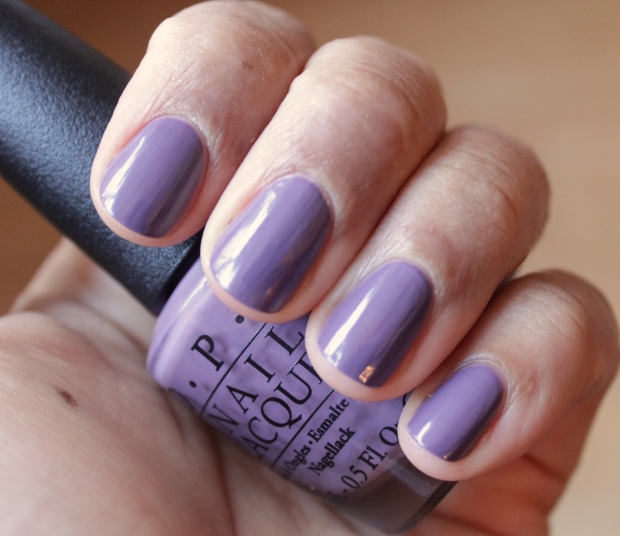
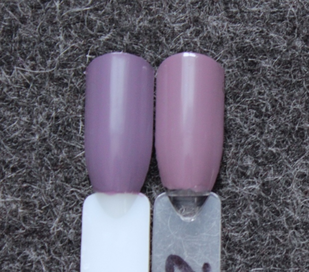
Purple Palazzo Pants
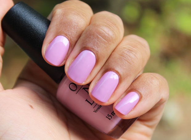
Another winner here for me, though I don’t exactly feel fall-ish when I look at it. This shade was a gorgeous formula as well – 2 coats and loads of shine all on it’s own. These types of purple-pink shades I find quite flattering on me as well.

The sad part about this shade is that it’s pretty similar to Chanel Sweet Lilac, which means I probably have to let it go (the OPI, not the Chanel {god forbid!}). I haven’t done it yet because I think I might wear it for one full manicure first…it’s clearly not an exact dupe but it’s close enough that in my purging state I can’t justify keeping both!
My Gondola or Yours?
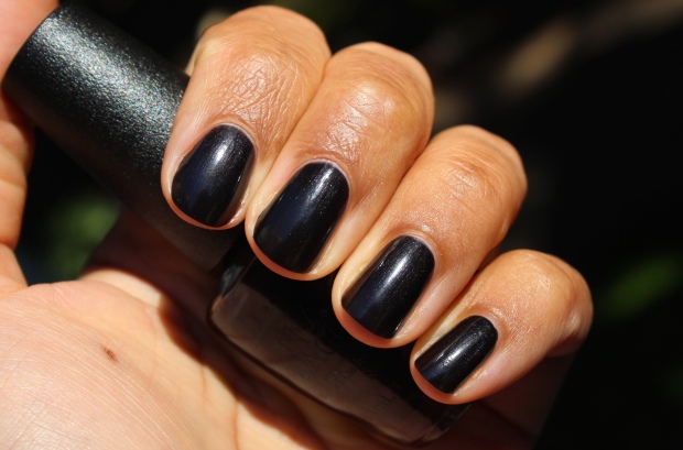
This was a surprise to me in two ways: 1) it contains shimmer, which you can see in direct sunlight, and 2) I really liked it on me! I’m not a fan of black polish on my nails, it always looks too harsh or something, but I really loved the effect of this shade. I don’t know if it was the shimmer that did it (it’s not very noticeable in the shade or indoors), or the subtle crelly finish, but whatever it is it’s working for me! This does require 3 coats for opacity but they weren’t fussy to apply at all. I don’t have any shades to compare to this as I don’t own black polish!
It’s a Piazza Cake
Another complete surprise was how much I enjoyed this shade, a devout non-orange wearer! Orange has never looked good on me IMO, but the burnt tones of this shade (which you see more in the first photo) make this quite wearable and absolutely the most perfect fall-ish shade! I’m wearing this as a full manicure right now (check it out on my Instagram) and it’s one of those shades I keep staring at, which is how I know it’s a keeper. SO pretty and different. And guys – this is a 1-coater! Here I’m wearing 2, but today I only did 1 (time of the essence, etc. etc. etc.). Fabulous! I also have nothing like this.
A Great Opera-tunity
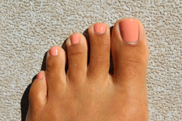
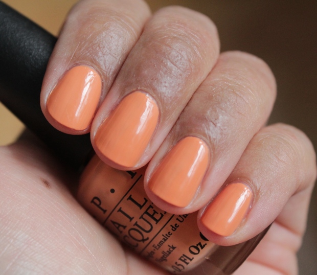
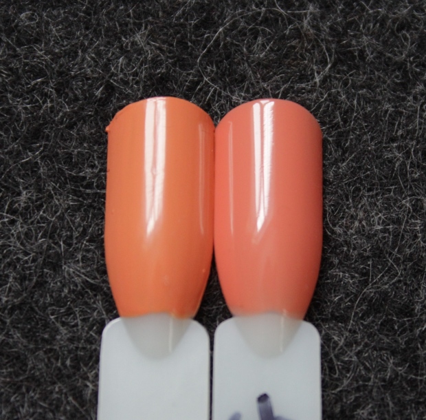
Yet another shade that I initially thought I wouldn’t like but ended up enjoying! It was a *bit* strange-looking on my hands as it made any redness stand out, but on toes – oh YES. I feel like I should be wandering around a fabulous resort with this shade on. It’s described as a melon and I’d say that’s accurate – it’s actually kind of perfect for the transition between summer and fall. Love this! Note that it is a little on the thick side so be careful in your application to ensure a smooth finish.
Compared to Chanel Inattendu, which is a peach-nude, this has more pink/red in it’s base. I like it’s uniqueness.
Venice the Party?
Ok, now we’ve reached the shades I was more ‘meh’ about. Though this is gorgeous in the bottle and probably lovely on the right skintone (it positively glows!), I didn’t like it on me at all. It also doesn’t make me think of fall very much – maybe if it were a bit deeper in tone. This is 1 of 3 LE shades in the collection so if you love it you need to snap it up sooner rather than later. Application was good, 2 easy coats, but beware that it does stain slightly. I also noticed chipping after 2 days with this one (I wore it as a full mani). I don’t really wear these kinds of colors so I have no comparison swatches for you, sorry!
I paired this with A Great Opera-unity for a mani/pedi combo…I wasn’t that into it, to be honest. Venice the Party? was too shimmery I think to suit it. Oh well!
Gimme a Lido Kiss
I had my fabulous assistant help me with these next two colors – she was getting bored the day I needed to take these shots so I occupied her with some of the bottles lol. She does good work, eh?
Gimme a Lido Kiss is a red shimmer that I found kind of dull, to be honest. The glow on this one isn’t all that fabulous, and it leads more orange than blue so on me I wasn’t wild about how it looks. Great formula though, thin but pigmented; you could almost make this a 1 coater but I’d go with 2 to be safe.
I thought Misa’s Red Pumps at the Nordstrom might be comparable to Gimme a Lido Kiss, but the former leans cooler and has that glow that the latter is lacking. I won’t be replacing that one, that’s for sure!
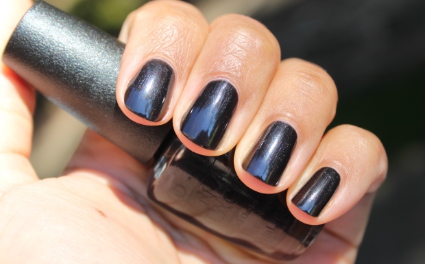
Up next ladies {and gents!}, we have St. Mark’s the Spot!
A ‘royal blue pearl,’ this shade has a lot of depth to it and is kind of mesmerizing to look at, no? That said, it’s not for me – shimmer polishes in strong colors just turn me off for some reason. This has a good formula as well, 2 easy coats, and it’s another LE shade so snap it up if you want it! Though I have a ton of blue shades, I don’t have any with an intense shimmer/metallic like this one.
I wore it with Gimme a Lido Kiss which I think was a better match than the previous pairing. Feels kind of US Patriotic now that I think about it!
Amore at the Grand Canal
I was eager to wear this shade because I love a deep red, and it is quite nice, though it looks brighter here than in person (and could probably use a top coat to really make it polished). It’s definitely pretty, but not terribly original. Good formula, 2 coats and no fuss.
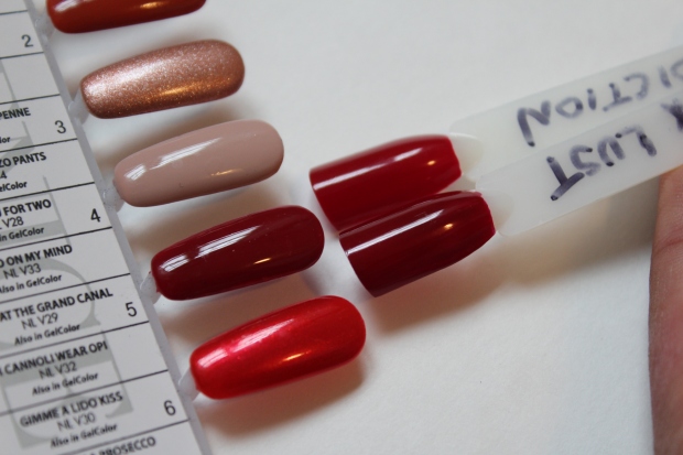
I knew when I saw ‘Amore’ that it would be similar to other shades in my collection: Tom Ford Bordeaux Lust and Essie Limited Addiction. It’s kind of a hybrid of the two, and while it’s nice I am definitely not keeping it over the other two. I wear red polish so rarely as it is I don’t need to add another to the mix anyway!
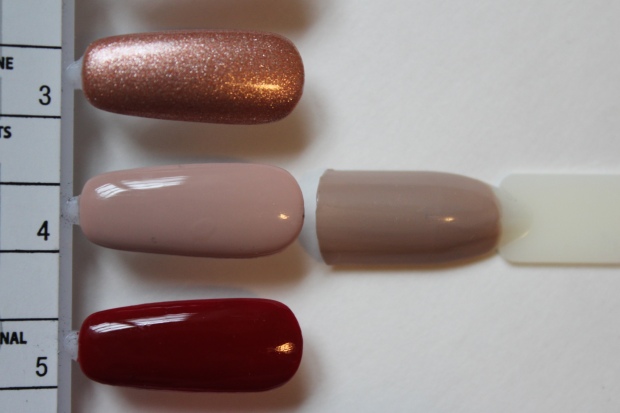
Worth a Pretty Penne

When I first laid eyes on this shade I was sure I was going to love it, but turns out it’s just too close to my skintone to be anything stand-out. That being said, this is a great polish with visual interest from the flecks of dark and light copper, and it could be a 1-coater if desired. It also has zero brushstrokes so if you’re a fan of metallic polishes you’ll like this one! I personally don’t love metallics so I have nothing to compare to this.
I paired Amore at the Grand Canal with Worth a Pretty Penne, and again I was kind of ‘meh’ about it. Looks nice enough and goes well together but it seems kind of ho-hum to me. Maybe I’m just fussy!
Gelato My Mind
This was another shade that did not say ‘fall’ to me in the least, but sometimes I think brands are just trying to do something unexpected so it doesn’t bother me when they include shades like this. This is a beautiful color to be sure, so vibrant – but the formula was not so great. The 1st coat was streaky and consecutive coats can become disastrous if not applied quickly, as this polish is prone to dragging.
Though I have several aqua shades, the only one Gelato My Mind is truly similar to is another OPI, Eternally Turquoise, the latter being a bit more muted and a hint less green. Due to the formula, I won’t even be entertaining the idea of keeping ‘Gelato’ – there’s no room for crappy polish anymore, no matter how pretty it is!
Be There in a Prosecco
This is an opaque cream shade, and while I do love pale tones lately, I wasn’t wild about this. Aside from the formula, which is a bit streaky but not terrible (especially for such a light shade), there is echoes of Zoya Cho about this that turn me off – I think it’s the more warm, yellowish leaning about it that doesn’t work for me. It’s like a dirty white.
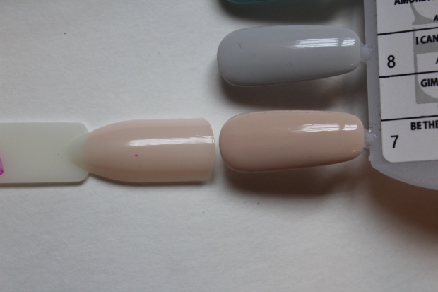
Once again, the comparison shot shows it much different in tone than it is IRL. The closest shade I have to it is OPI The Beige of Reason; however, that is a sheer so they end up looking quite different when worn – and ‘Beige‘ is lighter in tone, anyway.
Baroque…But Still Shopping!
This is the last of the 3 LE shades! I love the name of this one…actually I enjoy the names of a lot of these for once! I was really stoked for this shade and though it was going to be a winner, but….no. Just no. The tone of it isn’t great on my skin for one, which doesn’t make for a bad polish – just bad on me – but aside from that, it’s got those horrible glitter bits in it that just don’t work in an opaque polish! Remember Pineapples Have Peelings Too and how ugly that was? I thought at first this would be sheer, with all that glitter, but when I went to layer it, it just wasn’t happening – way too much pigmentation. Bleh. I don’t like this at all (but the formula is good, 2 quick coats to opacity). I have nothing to compare this to.
I Cannoli Wear OPI
Last but not least! Historically I don’t like pale grey tones one me as they usually lean too bluish and just don’t look cute. I feel the same about this shade, sadly, though I recognize my skintone doesn’t represent most, so this probably would look great on a lot of people! It’s got a thin formula that builds up nicely in 2 coats – it’s a touch fussy but less so than ‘Gelato‘ so if you like this shade it’s worth it to pick it up. As I don’t enjoy these shades I don’t have any comparisons for it.
There you have it – a timely review for a seasonal collection, hurrah! Hopefully the LE shades are still available if any of you are interested in those. Overall I quite liked this collection; while there were a few duds, even the shades I didn’t like on me I could appreciate being flattering on someone else. Considering fall is my favourite month I’m pleased OPI nailed this release!
OPI Brights summer 2015 collection {swatches & review}
Posted by Latoya in Aqua/Teal, Berry, Blue, Comparisons, Coral, Duochrome, Glitter, Metallic, Nail Polish, OPI, Pink, Purple, Red, Shimmer, Summer 2015, Summer Polish Combos, Yellow on June 22, 2015
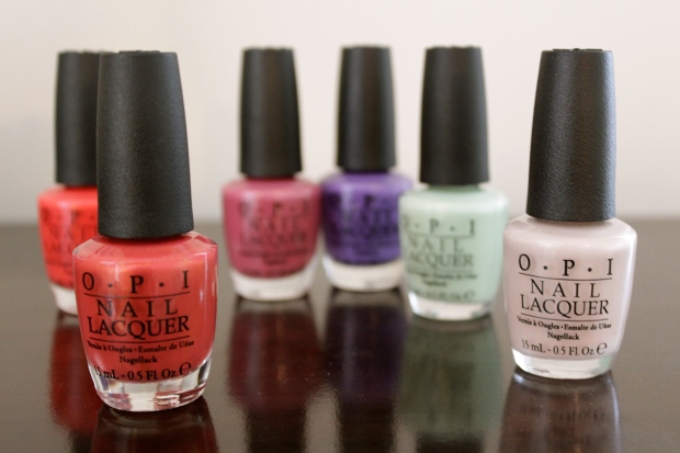
[This post contains press samples] Happy second day of summer! We’ve been having a lovely June so far, with a ton of sun sprinkled with a few rainy days to keep everything lush and green. As such, I’ve been switching up my mani & pedi shades on the regular, which is also helping me pare down my collection as I go through shade after shade and determine whether it stays or goes. The OPI Brights summer collection for 2015 kept me busy for a while, but I’ve finished all the swatches and have them to show you today! The collection contains 3 existing shades from the core collection, plus 6 brand new shades – all in varying finishes to keep things interesting.
I did a few mani/pedi pairings to easier facilitate the swatches, and also added comparison swatches for any shades that seemed to have close relatives in my existing collection. Let’s begin with the core shade Hotter than You Pink and new shade I Sea You Wear OPI:
Hotter than You Pink is described as a…’hot pink’, how novel. It’s a bright pink shade with a blue iridescent flash that I’m sure is a favourite for many. These kinds of colors aren’t my bag, but there’s absolutely nothing wrong with it – and the formula for this one is great, two coats to opacity and it flows easily on the nail with no drag.
I Sea You Wear OPI is yet another shimmering aqua confection from the brand, an iridescent metallic that is a classic come summer. This one is a bit sheer, like some other similar OPI shades, and requires 3 coats – even then, you can still see a bit of my nail line in certain lights (like above). It’s pretty though, and the formula otherwise is good with no patchiness.
Hotter than You Pink reminded me of the shade Hang Ten Toes from China Glaze’s Neon collection from 2012. Both that have blue flash, but CG’s polish is less shimmery and more cool-toned:
 Left: OPI Hotter Than You Pink; Right: China Glaze Hang Ten Toes
I figured I Sea You Wear OPI would be very similar to either the brand’s This Color’s Making Waves (recently reviewed) or Catch Me In Your Net, but it isn’t at all – it’s much more blue and shimmery (rather than metallic) than the former; and though similar in hue, it’s considerably lighter than CMIYN, with less depth.
 Left to right: OPI This Color’s Making Waves, OPI I Sea You Wear OPI, OPI Catch Me in Your Net
Next, I paired Life Gave Me Lemons with I STOP for Red:
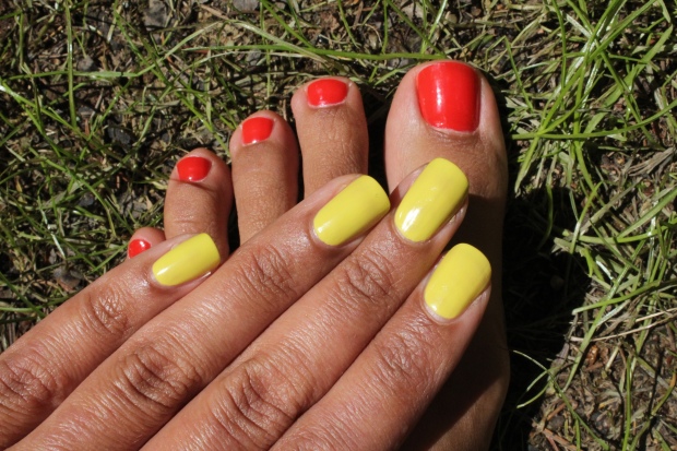
Life Gave Me Lemons is a core shade, a ‘citrusy lemon-lime’ creme that is very cheerful-looking. It does have a bit of green in it, which for some might make it more wearable than just a straight yellow, which can be tricky on some skintones. While I don’t love yellow polishes on the whole, I actually didn’t mind this – it’s just so happy-looking! Also, for a yellow, the formula isn’t all that bad – it requires a bit of care when applying, but it wasn’t as fussy as other yellows I’ve come across. This is two coats.
I STOP for Red is a tomato red crelly (creme-jelly hybrid) that has the best squishy texture I’ve seen! Though the shade is nothing new, it’s the texture that really makes it stand out – it’s so juicy and delectable. On shorter nails, two coats will do, but on longer nails or if you prefer no VNL, I’d go with three.
The green tones in Life Gave Me Lemons is much more apparent when compared to other yellows:
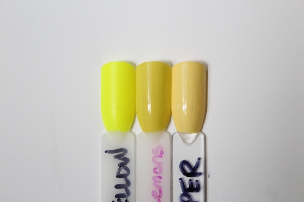 Left to right: American Apparel Neon Yellow, OPI Life Gave Me Lemons, butter London Jasper
It’s much more dull (and more glossy) compared to American Apparel Neon Yellow (my fave yellow EVER and the only one I have kept in my collection), though both have that touch of green. butter London’s Jasper on the other hand, is more *ahem* butter-y, and more of a true yellow color.
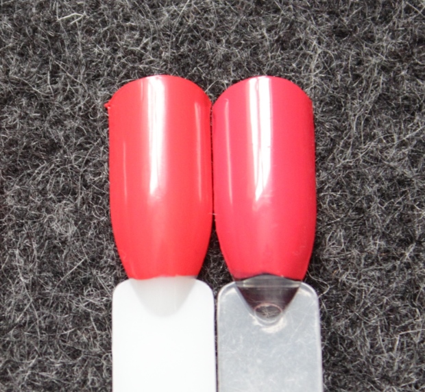
 Top to bottom: Essie Meet Me at Sunset, OPI No Stopping Me Now, OPI I STOP for Red, OPI Aloha from OPI, Essie Come Here!
IT IS FREAKING IMPOSSIBLE TO PHOTOGRAPH REDS!!! Gah. The five shades above look identical, I’m sure, and though they are VERY close, they are not the same. Essie Come Here! is more pink, OPI No Stopping Me Now and Essie Meet Me at Sunset are both more orange, and OPI Aloha from OPI is more coral. Though the latter is closest in tone, it’s a straight creme and doesn’t have that glossy, squishy texture.
The last pairing I did was with My Car Has Navy-gation and Down to the Core-al:
My Car Has Navy-gation is a gorgeous deep indigo blue that sadly is a bit of a disappointment once worn. It’s on the sheer side (this is three coats) and is streaky in it’s application. I think they were trying to achieve that crelly texture with this shade, too, but alas it didn’t translate properly in the final product. Let’s take a closer look:
The last of the core shades, Down to the Core-al is a ‘brilliant coral’ which has a touch of violet flash. This was quite pretty, a bit different than your standard summer coral, and easy to apply (this is two coats). Just the right hint of shimmer.
I own a fair number of blue polishes, but nothing was really like My Car Has Navy-gation:
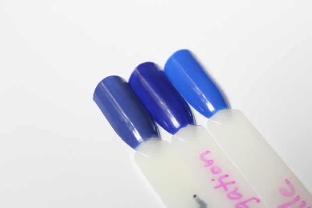 Left to right: Deborah Lippmann I Know What Boys Like, OPI My Car Has Navy-gation, YSL Bleu Majorelle
Lippmann’s I Know What Boys Like is more purple and less vivid, and YSL’s Bleu Majorelle is much brighter and without ANY purple tone.
 Left: OPI Down to the Core-al; Right: OPI Go With the Lava Flow
Once again, I thought a shade from the recently released Hawaii-themed collection from the brand would be very similar to Down to the Core-al; Go With the Lava Flow is a coral shimmer polish as well, but it is more shimmery and darker, and with a more murky quality to it (which you can’t really see in the photo above).
Can’t Hear Myself Pink! is described as a ‘shimmering metallic pink’, but there’s more to it than that. Though it’s more obvious in the bottle than on the nail, there is a subtle orange duochrome that elevates this shade and makes it more unique. Alone, this shade is pretty enough, but a touch sheer and requires three coats. On my index finger, I layered Can’t Hear Myself Pink! over Down to the Core-al, and this brought out the duochrome and intensified the shade beautifully. I don’t own anything even close to this shade.
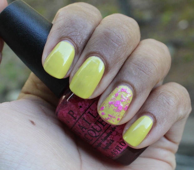
My regular readers know I’m not a fan of glitter polishes, and hot pink glitter On Pinks and Needles is no exception. It’s fine, it’s cute, but not for me – here it is layered over Life Gave Me Lemons (on only one nail because glitter removal is a P.I.T.A.):
Finally, we have my favorite shade from the collection, The Berry Thought of You, a ‘delectable purple.’ It’s a beautiful purple-based berry that has a touch of that crelly texture and an uber-glossy finish. Two coats and you’re good to go.
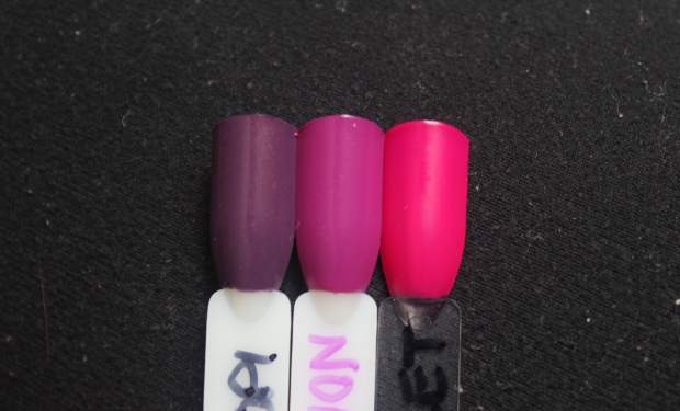
Dior’s Bloom polish, an LE shade from last spring I believe, is thisclose to The Berry Thought of You but a hint more pink. If it weren’t Dior, I’d get rid of it because I love the OPI shade more; as it is I’m keeping them both…for now. American Apparel’s Neon Violet has the same purple undertones but is more vivid (and matte, as neons tend to be); Nicole by OPI’s In Grape Demand looks straight-up purple in comparison.
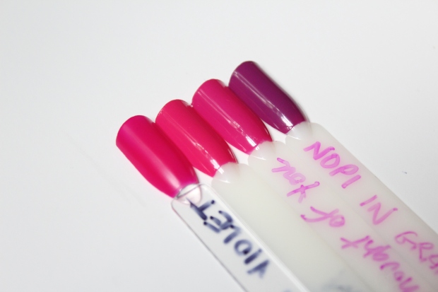 Left to right: American Apparel Neon Violet, Dior Bloom, OPI The Berry Thought of You, Nicole by OPI In Grape Demand
Though I didn’t find many of these truly ‘bright,’ OPI suggests layering them over white to make them truly pop, and while I didn’t try that I suspect I would have gotten a better effect by doing so. Nonetheless, I liked most of these shades and I think it’s a solid summer collection with a variety of color and finishes from which to choose. I actually am keeping a few of these, namely: The Berry Thought of You (naturally), Can’t Hear Myself Pink! (for layering over similar shades), and I STOP for Red (dat texture, tho!). Hooray for summer!
Has summer arrived where you are? Will you check out this year’s OPI Brights collection? What kind of shades do you gravitate toward in the summer?
Nicole by OPI Coca-Cola Collection {review and swatches}
Posted by Latoya in Brown, Comparisons, Glitter, Metallic, Nail Polish, Nicole by OPI, Orange, Purple, Red, Shimmer on May 15, 2015
I’m on a roll here, people, let’s just go with it.
I’ve only ever owned one nail polish from Nicole by OPI (I just can’t get past the ugly bottles!), so swatching the Coca-Cola collection was a relatively new experience for me. I’m also not a Coke lover (or even of pop in general, really – rarely drink the stuff) so at first many of the shades didn’t make sense to me, but I eventually got the references. Though most of the shades didn’t call to me, I tried to keep an open mind as I went through them – sometimes you find a gem when you least expect it, especially when it’s shades you might not have chosen otherwise.
Let’s begin with a classic, in all senses of the word.
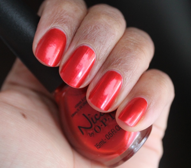
Always a Classic Coca-Cola is a richly-hued metallic red, reminiscent of the iconic Coca-Cola can. I like reds like this – strangely, I find metallic reds more wearable than cremes, which I find always look stark on my skintone. The formula was easy-peasy; two thin coats to opacity. As you can see, it IS a thin textured polish as any nail imperfections are noticeable -nothing a bit of top coat wouldn’t probably cure.
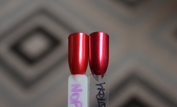 Left: Nicole by OPI Always a Classic Coca-Cola; Right: Misa’s Red Pumps at the Nordstrom
The shade reminded me of Misa’s Red Pumps at the Nordstrom, a beauty of a shade that I wear a lot during the holidays. I find Misa’s version, aside from being a bit deeper and cooler in tone, also has more depth – but both are pretty 🙂
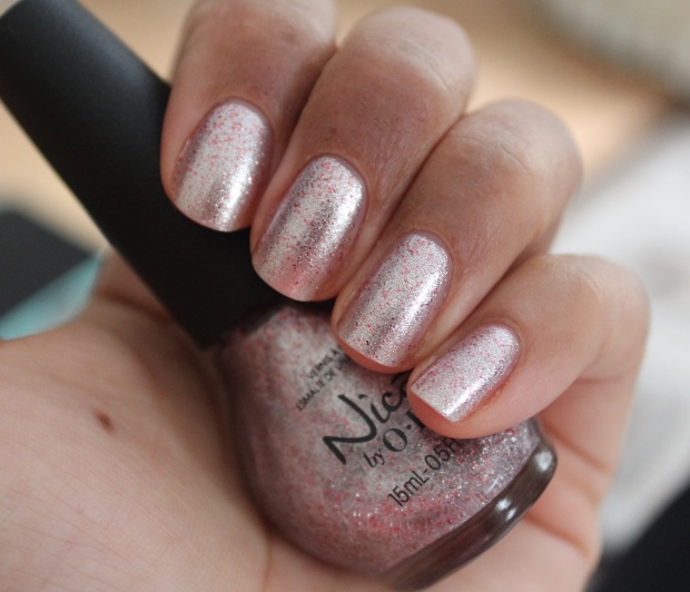
DC Lover (Diet Coke) is a silver foil with red glitter that surprised me by being quite pretty when worn. This is a shade I would NEVER choose if given the chance, but there’s something about it that’s kind of ethereal and lovely – the silver is just the right tone for my colouring, and the red flecks make it wholly different and interesting. Obviously, I have nothing like this. It’s a keeper! No issues with the formula or application whatsoever.
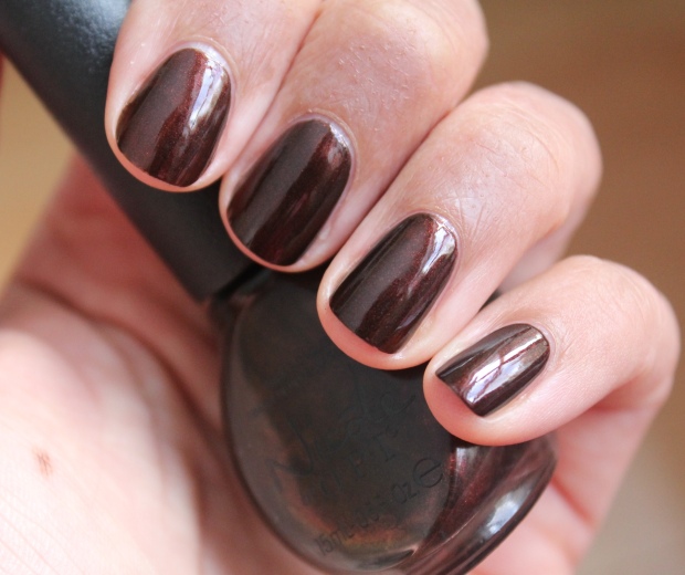
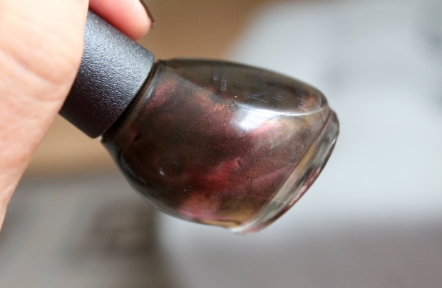
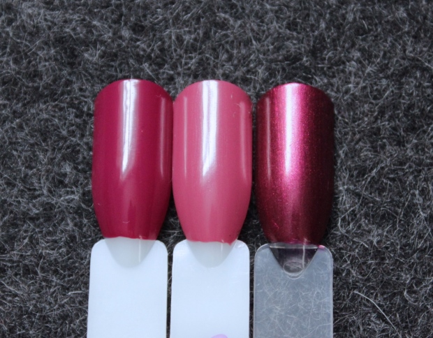
Zero is My Hero (Coke Zero) is a deep, dark burgundy brown which does a good job at mimicking the color of Coca-Cola itself. I thought I was going to LOVE this shade – rich, mysterious, shapeshifting goodness – but unfortunately it was a dud for me. The multifaceted flash you see in the bottle (below) doesn’t translate on the nail, and it’s depth can really only be seen in direct sunlight. It reminds me of China Glaze’s Midtown Magic, another delicious-looking shade that let me down once worn on the nail. Formula on this one was the only less-than-stellar in the bunch too – three coats were required to achieve opacity.
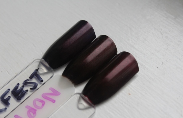
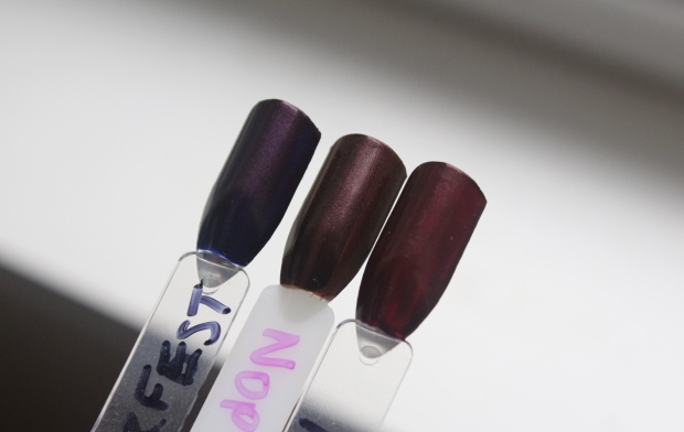 Left to right: OPI Every Month is Oktoberfest, Nicole by OPI Zero is My Hero, OPI Royal Rajah Ruby
I had a few polishes I thought might compare – OPI Every Month is Oktoberfest and OPI Royal Rajah Ruby. In the first swatch above they all look somewhat similar, but when you angle them the right way, you can see that ‘Oktoberfest’ has more purple in it’s base, and ‘Ruby’ has more red. Against the two of them, it really looks kind of blah, doesn’t it?
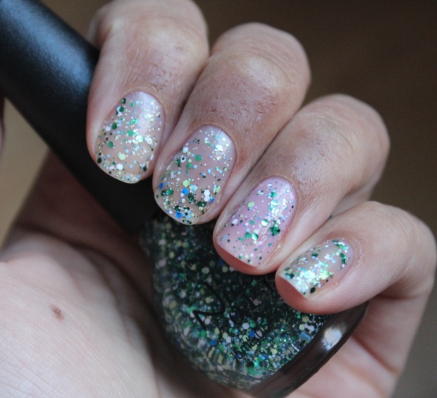
Seriously Citrus (Sprite) is a fresh mix of green, blue, and white glitter of varying sizes and tones. Not being a glitter fan, I didn’t love this – but it does look nice layered over other polishes – above I applied one coat over RBL’s Oh Snap! on my ring finger, and the contrast was quite pretty. I just HATE the removal of glitter polish SO. MUCH. This was no exception on that front.
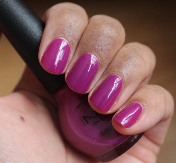
In Grape Demand (Grape Fanta) was another surprising win for me – I don’t typically fall for midtone polishes like this, particularly purple ones, but recently I decided I *needed* Essie Flowerista from the Spring 2015 collection – only to realize that this is essentially the same color. Another great formula on this one.
 Left to right: OPI Dutch’ya Just Love OPI?, Nicole by OPI In Grape Demand, American Apparel Neon Violet
The colors I have for comparison are clearly not even close to this shade, proving that I don’t buy colors like this normally.
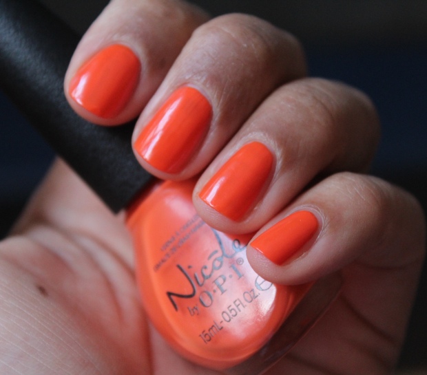
The Look is Orange (Orange Fanta) is for once an orange I can get behind! There’s not too much yellow in it to clash horribly with my skintone, and there’s a dash of red to make it even more wearable. This is going to be amazing as a pedi shade. Great formula too! You may have already seen me sporting this one on Instagram:
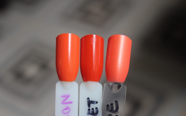 Left to right: Nicole by OPI The Look is Orange, Essie Meet Me At Sunset, LA Colors Magnetic Force
Here, you can see Essie Meet Me At Sunset is darker and more reddened, while LA Colors Magnetic Force is more coral than full-on orange.
Last year OPI did a Coca-Cola themed collection, which didn’t even hit my radar, but comparing the two collections now, I think Nicole by OPI did a better job – all of the Coke franchise flavours are represented in both collections (plus 3 additional ones in the OPI version), but the shades are more on point with this iteration (in my opinion). The only thing I’m not convinced of is that this is a spring-appropriate collection – but it seems more and more brands are releasing shades that don’t follow a seasonal theme, so what do I know? All I can say is that I’ll be hanging on to a few of these polishes – despite the unattractive bottles!
What do you think of this collection? Do you like Nicole by OPI polishes?
OPI Infinite Shine {review and swatches}
Posted by Latoya in Base Coats, Greige, Nail Polish, Neutral, Nude, OPI, Orange, Red, Top Coats on May 14, 2015
Delinquent blogger alert – I’ve had these photos done for a month; I have to post about these polishes already! I just received the OPI Brights 2015 collection today so I really need to catch up (I also have OPI Soft Shades 2015 collection and Nicole by OPI Coca Cola collection photos / swatches ready too, sooo…yea. I’m a bit behind).
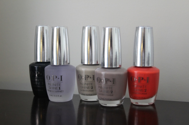
Today, however, we’re talking about the OPI Infinite Shine polishes, of which I have 3, plus the Primer base coat and Gloss top coat.
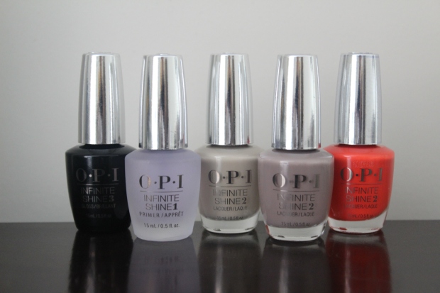
OPI released the new Infinite Shine formula back in the fall; it’s claim to fame is up to 10 days wear with a hi-def shine similar to gel nail treatments, but without the need of a light, nor the hassle of soaking off the polish. The 3 shades I received are: Maintaining My Sand-ity, Staying Neutral and No Stopping Me Now. Let’s look at the swatches first (note that I’m wearing the Primer and Gloss base/top coats in each swatch) and then I’ll get to the formula and wear time.
Maintaining My Sand-ity is a work-friendly, putty-toned nude that I thought I liked at first, but after wearing for a while found it’s slightly greenish hue made my hands look red. I think on the right skintone this would be a great, chic neutral shade but on me it’s just not entirely flattering. Formula was lovely with two smooth coats for opacity.
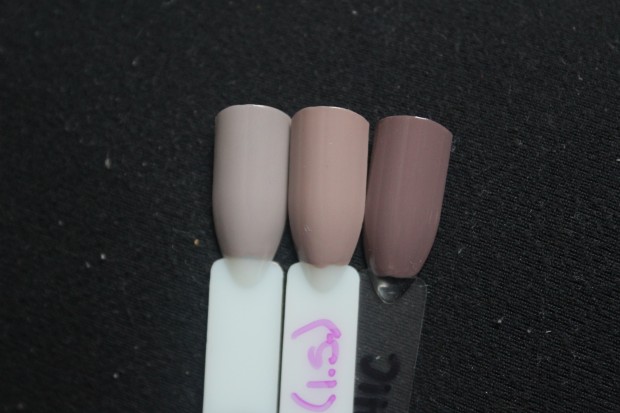
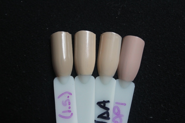 Left to right: OPI Maintaining My Sand-ity, Zoya Cho, OPI Glints of Glinda, OPI Do You Take Lei Away?
 Left to right: OPI Glints of Glinda, Zoya Cho, OPI Maintaining My Sand-ity, OPI Do You Take Lei Away?
I have a few shades that compare with Maintaining My Sand-ity, but they’re either a touch too light (OPI Glints of Glinda [which is also a sheer], Zoya Cho) or a bit more pink (OPI Do You Take Lei Away? – which I prefer over this shade).
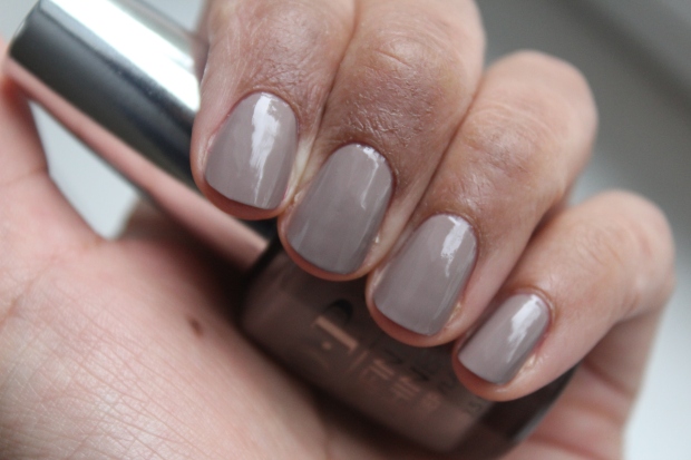
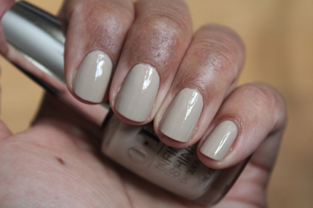
Staying Neutral is classic greige shade that is much more up my alley. It contrasts with my skintone just enough to make it stand out without being unflattering. Again, formula was stellar – two easy coats are shown above.
 Left to right: Essie Master Plan, OPI Staying Neutral, Sally Hansen Commander in Chic
It looks a bit cool-toned in the hand swatch above, but in the comparison swatches, particularly against Essie Master Plan, you can see that it’s actually got a bit of warmth to it so it doesn’t look too stark against the skin. I thought it would be really close to Sally Hansen Commander in Chic, but it’s much lighter, which I actually prefer as well.
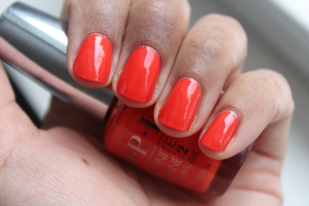
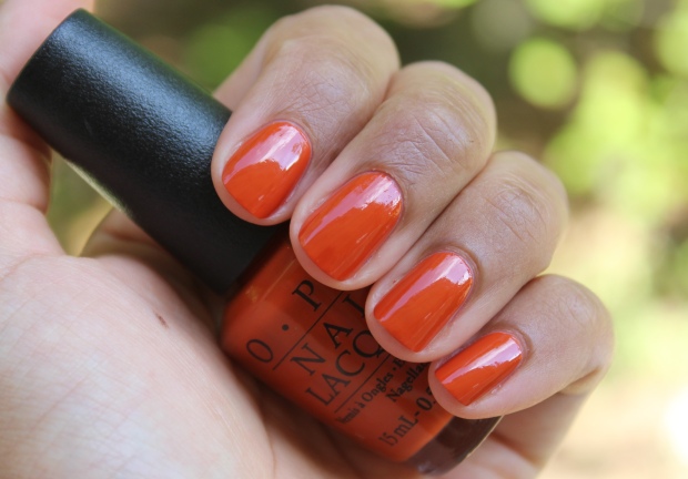
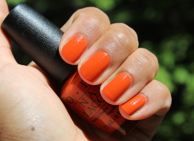
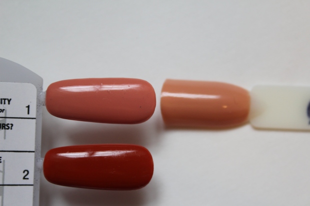
Finally, No Stopping Me Now is a bold orange-red that isn’t quite as searingly bright in the swatch above. It almost has a touch of coral to it as well – truly, a perfect tropical shade. I feel colors like this look good on almost anyone because they’re such a chameleon and can lean one way or another depending on the lighting/skintone/wardrobe etc. Formula, like the other two, was essentially perfect.
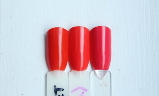 Left to right: Essie Meet Me At Sunset, OPI No Stopping Me Now, Essie Come Here!
Shades like this are SO EFFING HARD TO PHOTOGRAPH. It was impossible for me to clearly photograph the differences in tone between these 3 shades. Essie’s Meet Me At Sunset is more orange (absolutely no coral/pink at all), while Essie Come Here! is decidedly more pink. NOT THAT YOU CAN TELL IN THESE PHOTOS, though. Damn.
So, the long-wear, über-shine claims. I wore Staying Neutral for a full mani, employing the 3 steps by using the Primer (step 1) as my base, followed by 2 coats of color (step 2), topped with a coat of the Gloss (step 3). I had high hopes as a long-wearing glossy mani is hella-appreciated at this stage in my life; unfortunately, my nails chipped within a few days, and I didn’t particularly feel like the glossiness has retained it’s full-power shine. I read a great review of these polishes by Beauty Geeks, in which Karen notes that these polishes still likely require several minutes to ‘cure’ in natural UV light (aka THE SUN) for them to be truly long-wearing. I haven’t had a chance to try this, but I intend to – normally I could care less about long wearing shades as I tend to change my polish frequently, but I could really benefit from not having to worry about chipped nails for a week plus.
Ultimately, I’m more about the shades than the wear with polishes, so no matter what the case I’d still try more of these shades, especially if they all have formulas like these – smooth, glossy and oh-so-easy to apply.
Is wear time a factor for you when choosing a nail polish?
Swatching ain’t what it used to be: OPI Hawaii Spring 2015 Collection
A day after returning from the hospital with my beautiful baby girl in tow, the new Hawaii-themed spring collection from OPI landed on my doorstep. Equal parts excitement and anxiety flooded me – I mean, HOORAY! for new, fun nail polish to play with; but OHMAGERD how in the EFF am I going to swatch all these with a new babe to look after 24/7?
Basically, you swatch one shade a day until you get through ’em all.
I must say, once I finished I felt inordinately pleased with myself. NEW MOM, WHAT!?! However, its not perfection – my cuticles and hands are sort of a wreck, leftover from washing my hands 20 times a day in the NICU and then having no time to do damage control once we got home. Meh. Guess I can’t do everything.
Ok, less talky, more showy (time is a luxury, after all!).
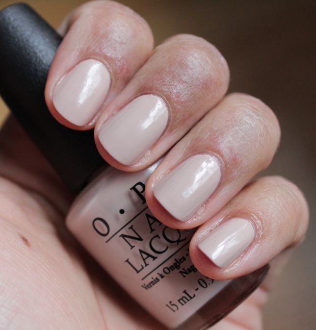
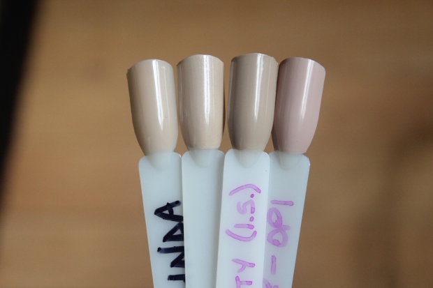
Starting with my favorite from the collection, Do You Take Lei Away? is a ‘creamy nude’ that applies very well for this kind of shade, smooth and even in 2 coats, and is neutral enough (not too warm or cool) that I think it will flatter most skintones.
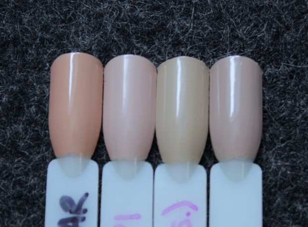 Left to right: Tom Ford Toasted Sugar, OPI Do You Take Lei Away?, OPI Maintaining My Sand-ity, Essie Jazz
I was unsurprised when I started pulling similar shades to compare against ‘Lei Away’ and discovered the closest match was a much-loved favorite, Essie Jazz. The OPI shade is just a hint more pink and less grey than Jazz and as such it looks a bit better against my skintone. My bottle of Jazz is halfway done (which means its almost finished, in polish terms), so I’m pleased to have a sort of newer, better version to take it’s place.
‘Pastel mint green’ That’s Hula-rious! is the kind of shade that I love in theory but which doesn’t always compliment my skintone. As is common with pastels, the formula is a bit streaky and needed 3 coats. The swatch above portrays it more vividly than it is – this shade was swatched during a snowstorm (one of many!!) so the natural light is much more dim and I had to overcompensate when taking the photo. The comparison photo below gives a more accurate indication of the shade.
 Left to right: China Glaze Re-fresh Mint, OPI That’s Hula-rious!, butter London Bossy Boots
China Glaze Re-fresh Mint is very similar, but is a smidgen lighter and less green, and the formula for it was atrocious. I far prefer this version.
A ‘reef-inspired purple’, Lost My Bikini in Molokini feels like the perfect shade for spring – its vibrant and playful but not too bright. 2 coats were required to achieve opacity; the formula is good but not perfect and needs a tiny bit of attention to avoid streaking. This polish stained my nails a tad when I removed it, so keep that in mind.
 Left: OPI Lost My Bikini in Molokini; Right: Rescue Beauty Lounge Mismas
I thought that RBL’s Mismas would be a close dupe to this color, but in fact it’s a few shades darker. I think I like the lighter tones of the OPI shade actually – I really like wearing colors according to seasons (so sue me) and Mismas doesn’t seem to fit into any of them, in my view.
Described as a dark, creamy mauve, Just Lanai-ing Around is one of those midtone shades that I’m not a fan of – I prefer a strong contrast against my skintone. Personal preferences aside, the formula on this color is excellent and only required 2 easy coats to reach opacity.
 Left to right: OPI No Spain, No Gain, OPI Just Lanai-ing Around, OPI Diva of Geneva
In my mind, ‘Lanai-ing‘ was very similar to OPI No Spain, No Gain (another midtone shade I dislike), but it’s much lighter. OPI Diva of Geneva is a shimmer, of course, and in any case it’s also much darker and richer in tone.
Go With the Lava Flow is a ‘golden red’ that leans coral and has a slight orange flash, which you can see only at the right angle. Normally this type of color isn’t my bag, but looking at these swatches makes me want to give it another go – it’s kind of intriguing, no? It took 3 coats to get the opacity I desired, but the polish applied well with no issues. I don’t have any shades comparable to this.
Aloha From OPI is a ‘bright creamy coral’ that has just enough pink to keep it from being a true red. It’s been so long since I’ve worn a bright like this, it gets me in the mood for warmer weather! Though its a cream, it applied a touch streaky and I needed 3 coats to even it out to my liking. I don’t find this shade particularly unique, but it’s pretty nonetheless.
 Left: OPI Aloha From OPI; Right: Essie Come Here
A very close dupe for this shade is Essie’s Come Here, a favourite of mine. Essie’s version is ever so slightly more pink, but to me they’re essentially the same. Come Here has it’s own application issues, but I think I’d keep it over Aloha From OPI simply because I like square bottles better 😉
Halfway through, guys. At this point I was on day 7 and getting better at painting my nails between one feed, and then stealthily putting Elena down long enough to take photos between another. Swatches over showers, oh YEA.
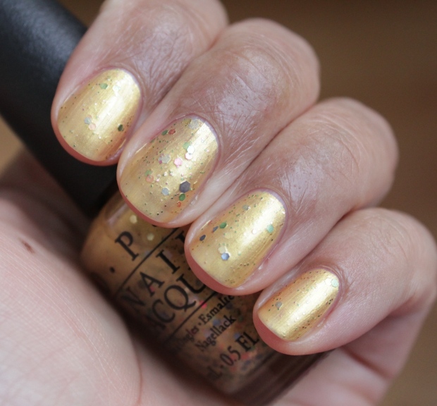
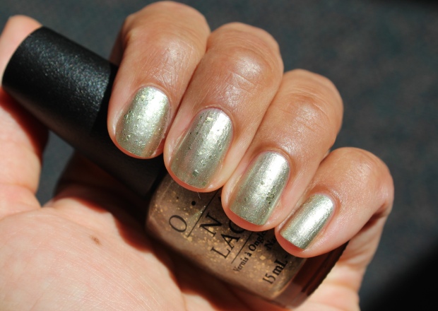
Pineapples Have Peelings Too is…well, it’s just bizarre, what can I say? A ‘gold shimmer with colorful sparkle,’ when I pulled this shade out for the first time I was like ‘What the…?’ It is NOT pretty, you guys. Whoever thought up this shade was reaching, big time (though the name is perfect, I think). As the gold base is quite sheer, it required 3 coats to build up opacity. Interestingly enough, I actually quite like the base color, and I’m very picky about my golds (if you recall…). But the glitter bits are garish and the base covers over their sparkle to make it all look dull and blah. ME NO LIKEY (does anyone?). Obviously, this is a one-of-a-kind shade.
Is Mai Tai Crooked?, an ‘orange crème’, is one of those polarizing shades I think. Though it’s base isn’t too yellow, which can go terribly wrong on some people (like myself), it’s still not a flattering color on me. I do love the name though 😉 3 coats are needed to help even out patchiness, though if you were really careful you could probably get away with 2. Patchiness seems to plague most of the cream shades in this collection I find.
 Left: OPI Is Mai Tai Crooked?; Right: Essie Resort Fling
The comparison above is a perfect example of the small nuances that can make or break a shade on my skintone. Essie Resort Fling is more peach than orange, of course, but the pink-leaning base versus the yellow-leaning one makes all the difference for me.
Suzy Shops & Island Hops…oh how I love the look of this shade! Described as a ‘light and happy pink,’ I find this color super-flattering on my skintone. But of course, pastel shades often come with issues, and this shade needed 3 coats to even out the patchiness. But I don’t mind TOO much, because PRETTY.
I must be having a pink moment, because I also love RBL’s Oh Slap!, which is close to ‘Suzy Shops’ though without as much white in the base. I’m tempted to only keep the RBL, but I really love the way the OPI looks so despite it being kind of a PITA to apply, I’ll hang on to it for a while, anyway.
Hello Hawaii Ya? is a ‘dusky purple’ and the type of color that used to appeal to me, for whatever reason. But though it works with my skintone, it’s kind of drab, and I prefer bright and punchy for spring shades. Surprisingly (or unsurprisingly, for this collection), the formula wasn’t great and I needed 3 coats to smooth out patchiness, which still didn’t fully even things out. I think this color would be lovely on a lighter or darker skintone than mine, but it veers into that ‘midtone’ territory and I have too many other polishes in which to devote my time.
 Left: OPI Hello Hawaii Ya? Right: OPI Parlez Vous OPI?
I think the reason I thought I’d like this shade is because when I first got my hands on OPI Parlez Vous OPI?, I adored the way it looked on me. But my tastes have changed over the years, and now I find it looks dull and muddy. These are clearly not dupes but they’re definitely distant relatives.
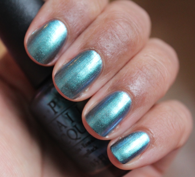
This Color’s Making Waves should look familiar… This ‘shimmery, lagoon blue’ is a pretty marine shade makes me long for summer in a big way! It’s kind of a pain though, as it needed 4 coats to reach this opacity. It’s quite thin and watery, and as it’s not terribly unique I am less than enamoured by it. I have a very close dupe in…
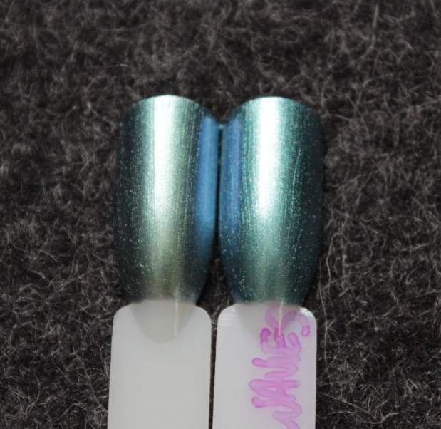
…Chanel’s Azure. Obviously. For the nitpicky among you, they aren’t exactly the same – Azure has more green in it, and OPI’s version has tiny silver flecks of shimmer running through it to set it apart. Both have a duo chrome flash, but Azure’s is more teal-blue-green, whereas ‘Making Waves’ is more teal-blue-purple. Meh. To me they’re damn near identical, and Azure only requires 2 coats (and, um, it’s Chanel), so it’s the winner in my books!
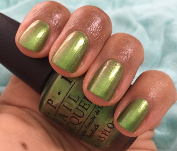
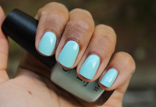
Finalement. My Gecko Does Tricks. A ‘bright and pearly green’ that has a sort-of orange flash in the right light (as seen in the second photo, which I took with my phone and I previewed on Instagram). I’m not a fan of green polishes generally, which I’ve mentioned on several occasions. Though I probably won’t wear this much if at all (except St. Patty’s Day and maybe Christmas), it kind of grew on me a bit – it isn’t too yellowed (blech)/saturated (due to the shimmer)/dark (and therefore murky) to turn me off, I guess. It’s almost…flattering, if you like greens. It did need 3 coats however, so there’s that.
Overall, the collection was a mixed bag in terms of formula and shades. Many of the polishes were somewhat subpar in terms of performance and some of the shades weren’t to my taste (that’s just my opinion though!). I did have some favorites though, namely Do You Take Lei Away?, Lost My Bikini in Molokini, Go With the Lava Flow, and Suzi Shops & Island Hops (despite the crappy formula).
The Hawaii Collection by OPI is available now in both nail lacquer and GelColor formulas, at professional salons nationwide as well as ULTA and Nail Polish Canada.
*Product samples were provided for my unbiased consideration.
Covering the fall polish bases with Essie and Zoya
As many of you are aware, I’ve been scaling way back on my beauty purchases lately, for various reasons (personal quest to reduce, baby on the way, and working toward a new home to sum it up). SNOOOOOOOOOOOOOOOOOOOOOOOZE. I’m so tired to repeating the same ol’ every friggin’ day, and I’m sure you’re tired of hearing it! SO, today I had the chance to take a ton of photos of a bunch of fun makeup and the like, some purchased and some received, and this week I plan on showing you guys all the good stuff that’s helping me keep my beauty game tight (or as tight as it can be given the circumstances). Today we’re going to start slow with the few nail polishes I’ve added to my collection that are just perfect for fall.
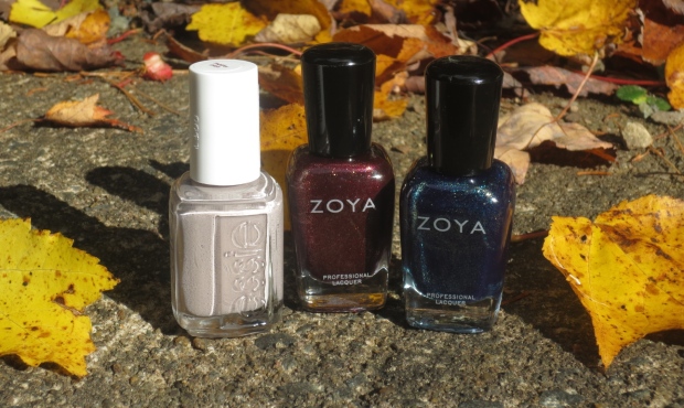
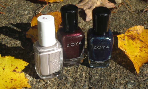
As soon as the Zoya Entice and Ignite fall collections were announced, I knew I had to scoop up some of those gorgeous shades! Zoya is probably the brand that’s most represented in my collection, followed closely by Essie. I love both brands for different reasons – Zoya tends to come out with original shades that just reel me in every. damn. time., and Essie creates beautifully feminine and elegant shades that always make me feel at once both chic and refined. It should come as no surprise, then, that the three shades I have to show you today are from both brands. Let’s begin with the Essie shade I’ve been eyeing for ages and finally purchased – Master Plan.
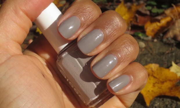
Master Plan is described as a ‘mischievous soft grey’ and I’d say that’s reasonably accurate. To my eye, it’s one of those true ‘greige’ shades, that falls smack dab in the middle of grey and and beige and tends to be incredibly wearable for most skin tones. Interestingly enough, initially I felt that Master Plan looked odd against my skin, almost clashing with the brown tone in a bad way – but after wearing it for a mere day, I completely did a 180 and decided that I loved how striking it looked, and the ‘clash’ I had perceived was actually a good thing, as it kept the shade from being too plain and melding too closely to my skin.
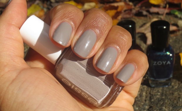
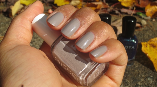
The formula on this polish was particularly wonderful, as Essie does tend to be a runnier, thinner formula. This shade had a thinner yet intensely pigmented formula which *almost* allowed it to be a one coater, but of course I used two because c’mon – two just looks better. It flowed so easily on the nail, and was a quick and easy manicure to pull off, which is a HUGE plus for me lately as I just can’t be bothered to fuss more often than not. It was quite shiny on it’s own (these shots were taken after 5 days of wear) so I skipped top coat. Glorious all around!
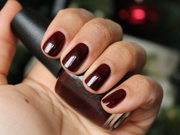
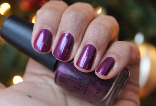
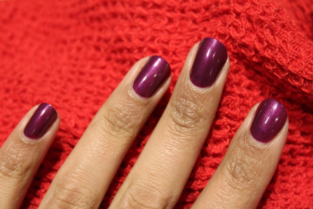
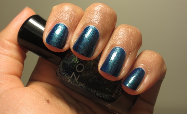
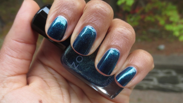
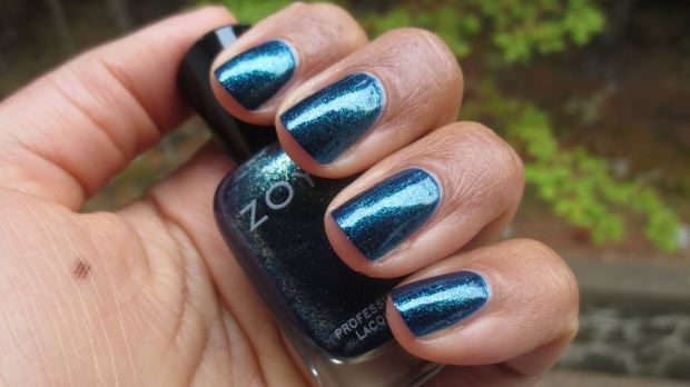
The two shades I picked up from Zoya’s Ignite collection (the Entice collection was lovely, but a little bit more unoriginal in my opinion) were Remy, a ‘brilliant indigo with copper and gold liquid metallic,’ and India, a ‘deep, luxurious red with a gold liquid metallic shimmer.’ I found that both descriptions were close, but not completely on-point. Remy is a gorgeous deep teal-indigo shade, yes, but the shimmer I see is not copper and gold, but rather a lighter teal. This could just be that the base shade has coated the copper and gold shimmer – either way, it’s a complex and beautiful shade that I absolutely love. Two quick coats plus top coat to really amp up the shine and shimmer, and you’re good to go!
Unfortunately, while wearing Remy the sun made a disappearing act for a few days, so I don’t have any shots of it in it’s full glory – but I think you can still get the idea of the depth and of it’s inner glow from my swatches (indoors – above; and in natural yet overcast light – below).
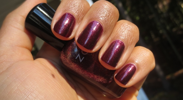
India in the bottle, is indeed a deep, luxurious red, and I can see the golden shimmer better here – but it does lean a touch plum in the right lighting. I was hoping for it to be a bit more ruby red, but nonetheless this is also a stunning shade that is absolutely perfect for fall. Again, application was a breeze with two quick coats plus top coat.
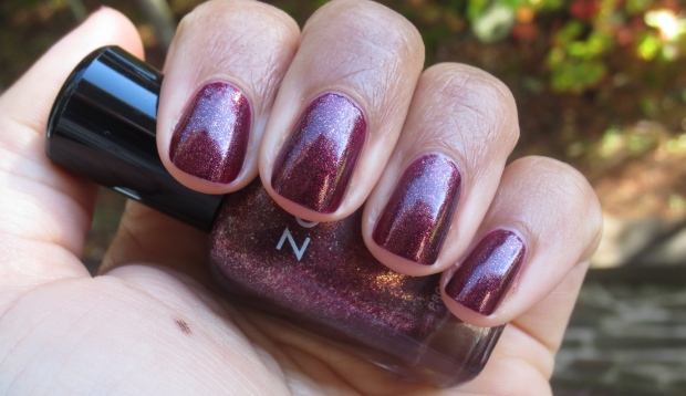
Above, in overcast light, you can still see the shimmer but it’s glowing quality is reduced somewhat. However, can you see what I mean about the plummy tones? Below, the shimmering goodness is on full display in sunlight, and it’s here that the polish really comes to life. The second photo again you can see a bit of a plum leaning to India – totally pretty, just not what I’d expected.
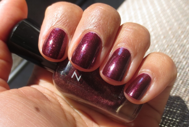
Both Remy and India were easy to apply, but take care in removal because they are a touch messy (but not really that bad). Remy I found stained my nails a bit more than India, but nothing too serious.
I’ve made a point this year to pull out 10 of my favourite fall polishes and display them on my dresser, to be the only shades I wear during the season (an effort to use things up!). However, I feel a strong urge just to put these three polishes on rotate, as they cover the bases for me in terms of what I desire in a fall polish – an edgy neutral; a unique, moody hue; and a feminine shade with just a hint of vampiness. I’m utterly pleased with all of them!
Have you picked up any new polishes for the season? What types of shades do you gravitate toward the most this time of year?
-
You are currently browsing the archives for the Red category.


Must Reads
SERIES

BEST BANG FOR YOUR BUCK

MY COLLECTIONS

SUMMER POLISH COMBOS

